🌍 Public
A6_T3.1
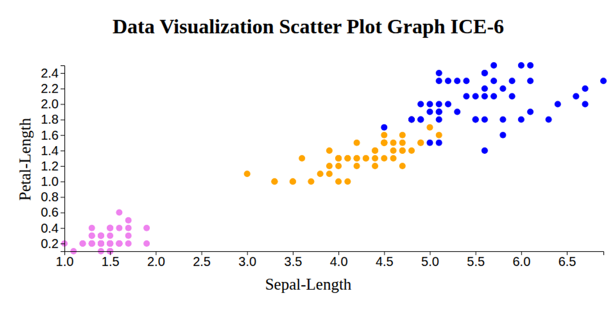
This visualization displays the Iris dataset as a scatter plot, using petal length on the x-axis and petal width on the y-axis. Each point represents a flower sample, colored by species: skyblue for setosa, lightgreen for versicolor, and orange for virginica. The visualization uses D3 v6 with scaleLinear for axes and d3.csv to load the remote data. It also includes rotated axis labels for clarity, rendered as SVG circles with fixed radius of 5 pixels.
AI-generated descriptionDisplaying the IRIS dataset using Scatter plot.
MIT Licensed




Comments
Sign in to join the discussion.