Fork of Customizing Axes
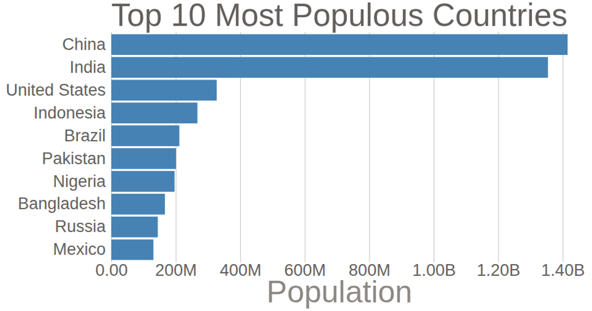
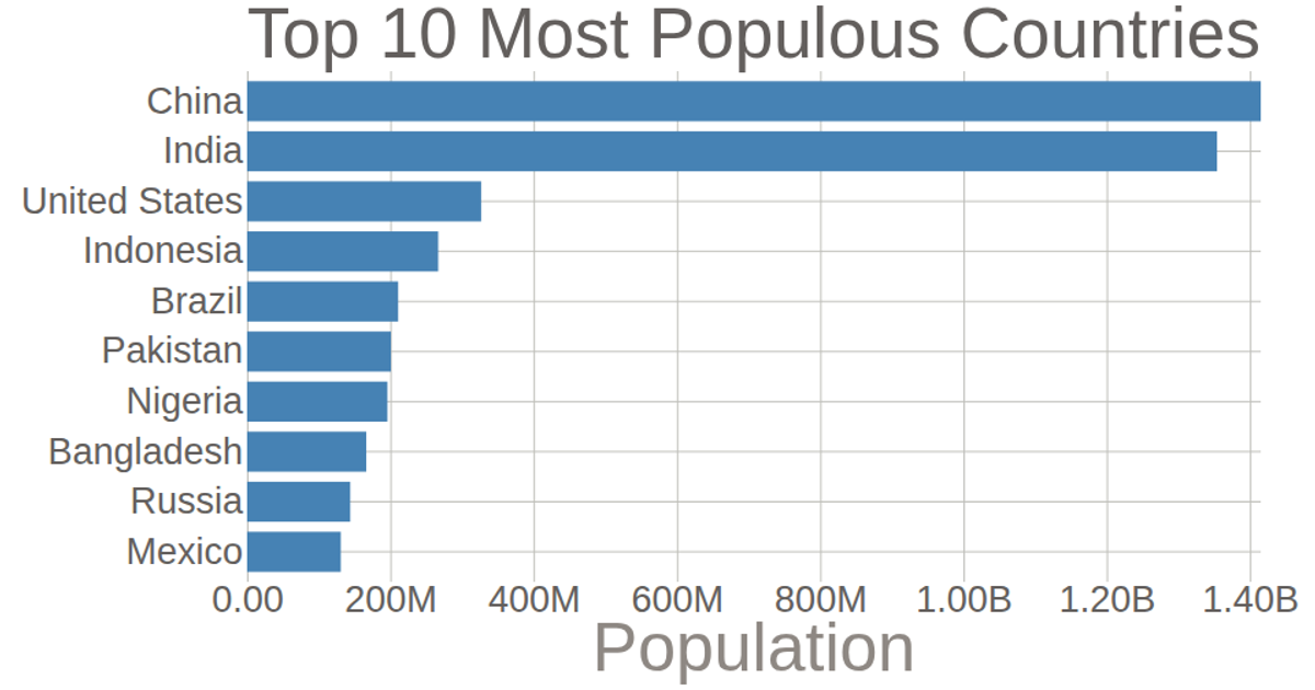
This bar chart displays the population of the top 10 most populous countries for 2018, using data from the United Nations World Population Prospects. It shows how D3 axes can be customized through the `axisLeft` and `axisBottom` functions. Each bar’s length corresponds to the population value, with a linear scale for the x-axis and a band scale for country names on the y-axis. The code explicitly removes tick lines and domain paths, and reformats tick labels using `format` to abbreviate large numbers.
AI-generated descriptionThis bar chart shows population of the top 10 most populous countries. The data comes from the year 2018 estimate in United Nations: World Population Prospects 2017. It also demonstrates customization of D3 axes.
See also the first bar chart visualization that this one builds on: Making a Bar Chart.





Comments
Sign in to join the discussion.