🌍 Public
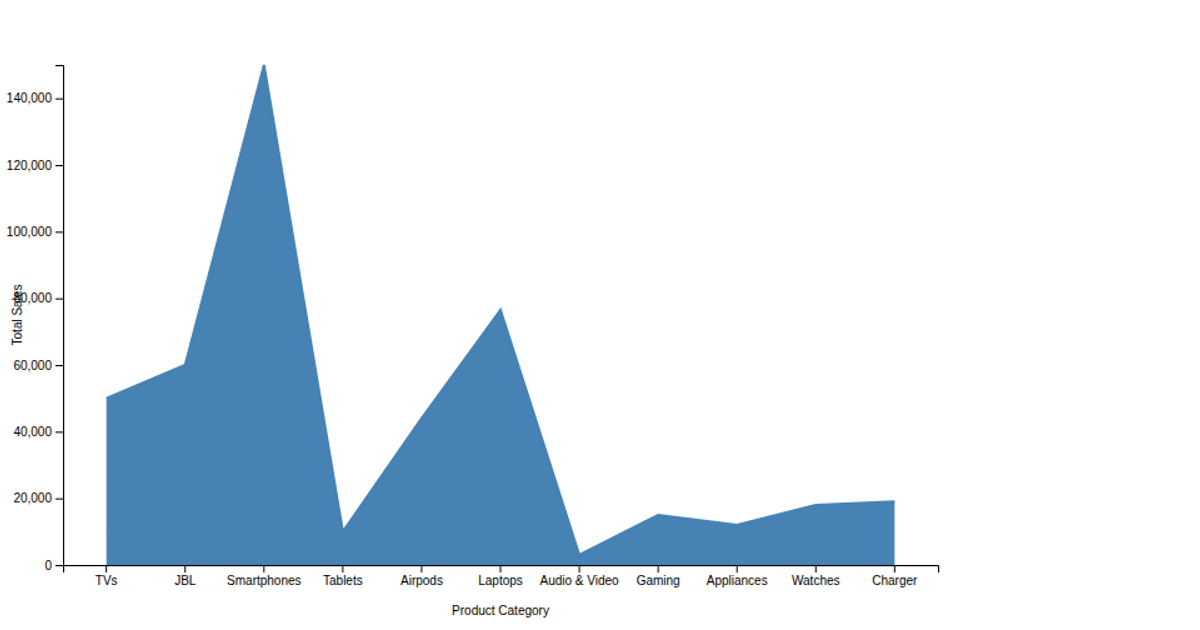
brand sales for area chart
This area chart displays total mobile brand sales from 2013 to 2021, with dates on the x-axis and sales totals on the y-axis. The visualization uses D3 v5 APIs including `scaleTime`, `scaleLinear`, `axisBottom`, `axisLeft`, and `line` to generate a smooth path within an SVG. The data is loaded from a remote CSV file via `csv()`, and date strings are parsed using `d3.timeParse`. Grid lines extend across the plot area from tick marks, with blue axis labels for clarity.
AI-generated descriptionAn example showing the capabilities of VizHub:
- Loads D3 via UNPKG.
- Demonstrates use of
importfrom"d3". - Demonstrates use of
importfrom local ES6 modules.
MIT Licensed



Comments
Sign in to join the discussion.