🌍 Public
Fork of Coronavirus Deaths Over Time by Country With Voronoi Overlay
Vvanquisher2000
Last edited Aug 15, 2021
Created on Aug 15, 2021
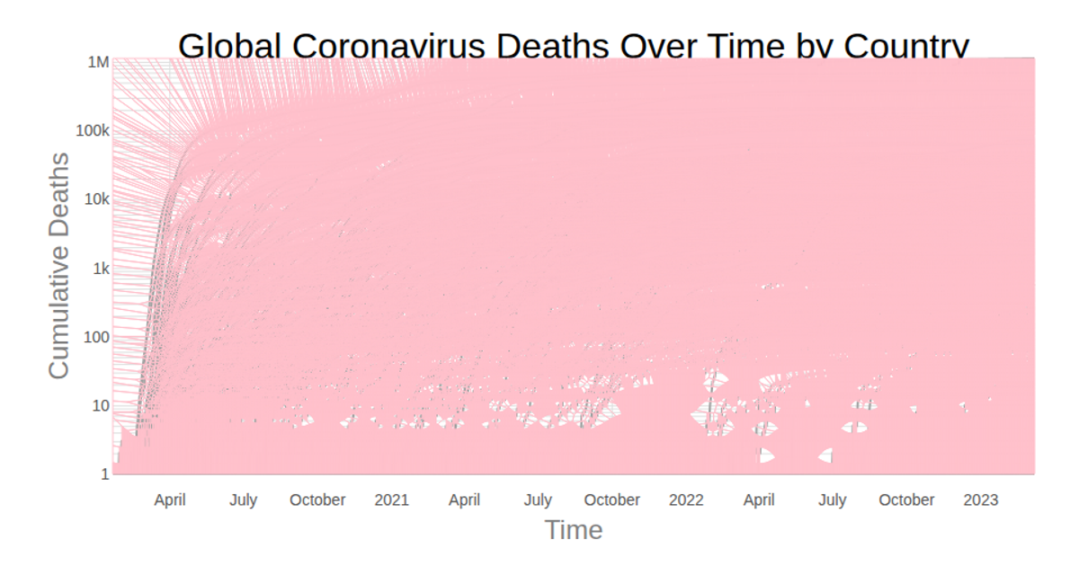
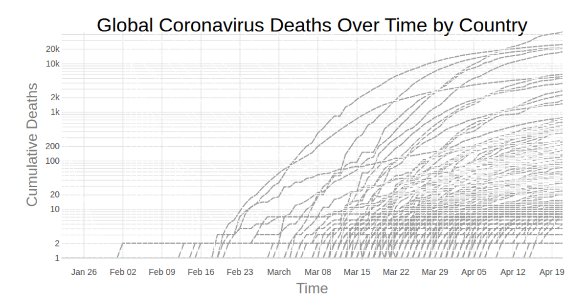
A fork of a line chart displays global cumulative COVID-19 deaths over time, with each country’s trajectory as a gray line. A Voronoi overlay, computed via the `d3.delaunay` and `d3.Delaunay.voronoi` APIs, makes the nearest data point under the cursor hoverable, highlighting the corresponding country’s line in black. Built with React and D3 v5, the chart uses `d3.scaleTime`, `d3.scaleLog`, and `d3.line` to map dates and log-scaled death totals, rendering as SVG. Data comes from the Johns Hopkins Coronavirus dataset, parsed with `d3.csv`.
AI-generated descriptionLine chart of Coronavirus cases to date. Data from Johns Hopkins Coronavirus Dataset.
MIT Licensed




Comments
Sign in to join the discussion.