🌍 Public
Area_Chart
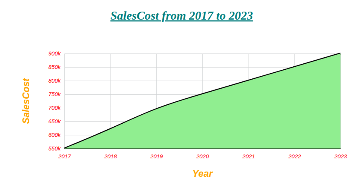
This area chart visualizes expected EV production and sales in the US from 2010 to 2030. The graphic combines a smooth, black trend line with an orangered filled area beneath it, clearly showing the projected growth over time. The visualization is rendered as an SVG using D3 v5, with a time-scaled x-axis and a linear y-axis. The code leverages D3’s `area`, `line`, `curveBasis`, `scaleTime`, `scaleLinear`, `axisLeft`, and `axisBottom` APIs to generate the chart. Data is parsed from a CSV file hosted on GitHub, with years converted using `timeParse`.
AI-generated descriptionMIT Licensed


Comments
Sign in to join the discussion.