🌍 Public
Fork of Making a Bar Chart
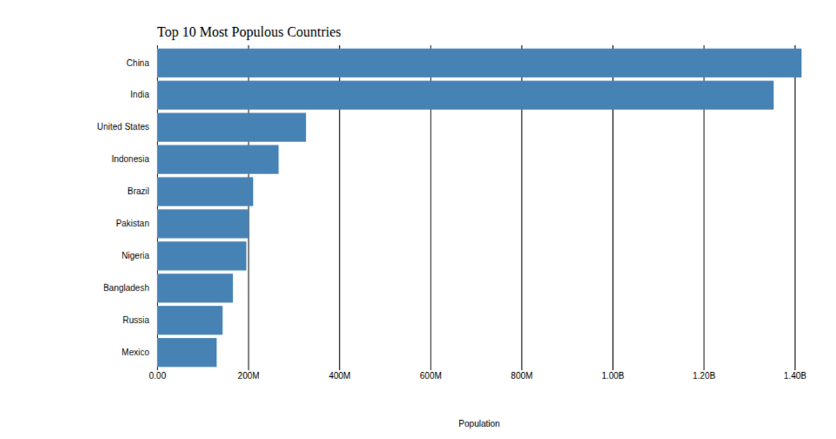
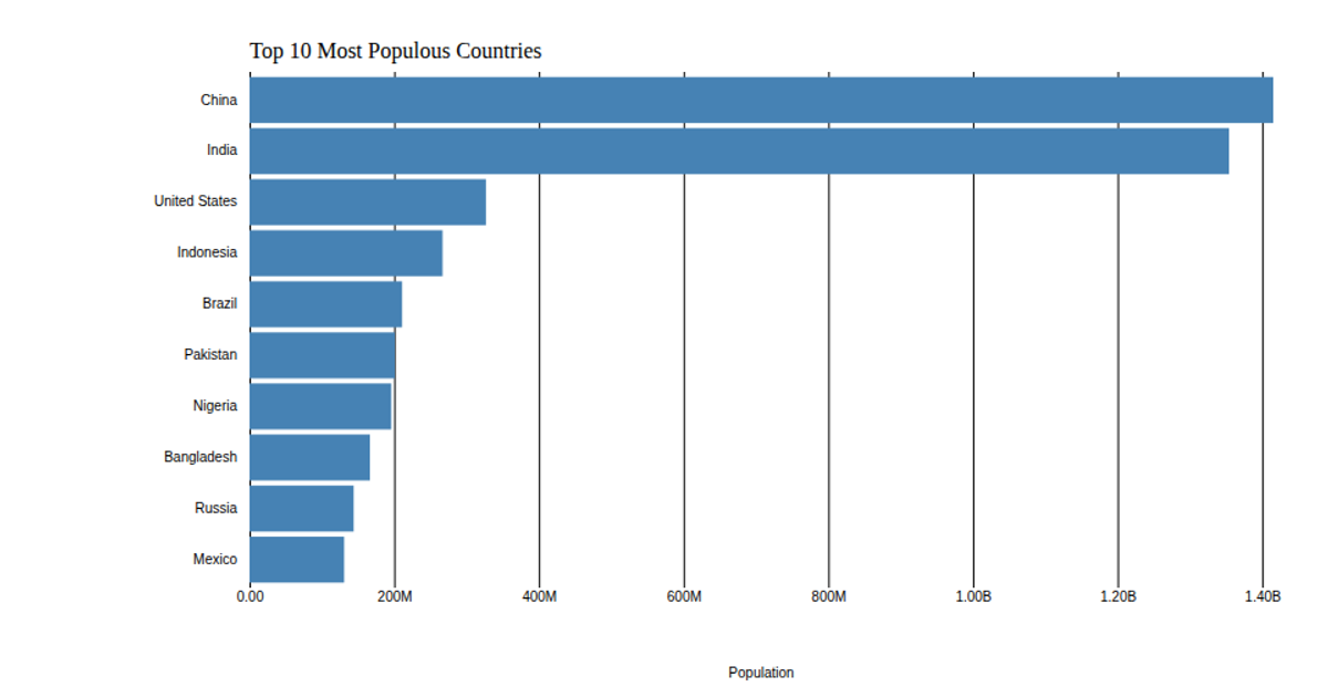
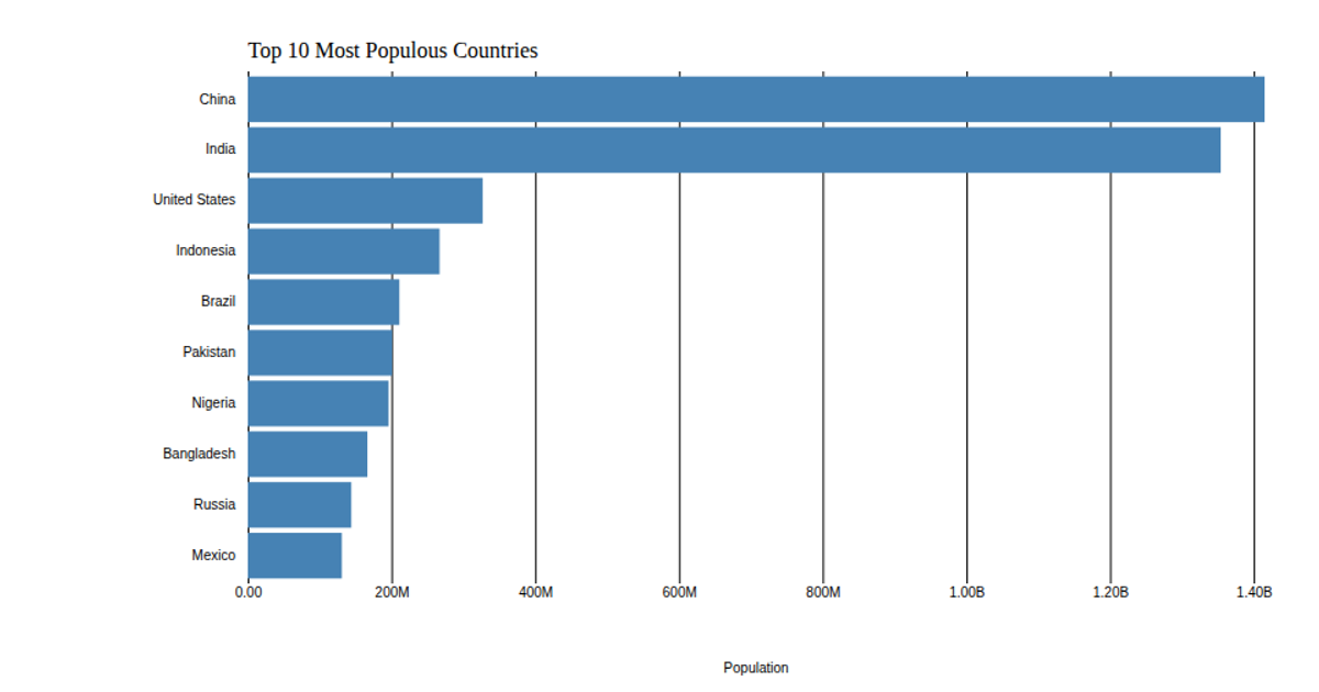
This example displays a horizontal bar chart of the top 10 most populous countries, based on 2018 United Nations data. It uses d3.scaleLinear and d3.scaleBand to map population values and country names, with d3.axisLeft and d3.axisBottom for the axes. The chart customizes the x-axis tick format to show values in billions and removes axis domain and tick lines, while the title and axis label are added as SVG text elements.
AI-generated descriptionThis bar chart shows population of the top 10 most populous countries. The data comes from the year 2018 estimate in United Nations: World Population Prospects 2017. It also demonstrates customization of D3 axes.
MIT Licensed



Comments
Sign in to join the discussion.