🌍 Public
Man SDV Activity6_Task3
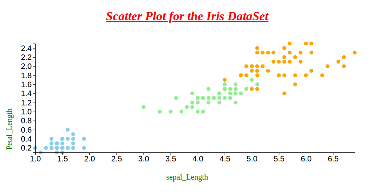
This scatter plot visualizes the Iris dataset, showing the relationship between petal length (x-axis) and petal width (y-axis), with each point colored by species (skyblue for setosa, lightgreen for versicolor, orange for virginica). The code loads CSV data via `d3.csv`, uses `d3.scaleLinear` with `d3.extent` for scales, and renders circles with `d3.axisLeft` and `d3.axisBottom` for axes. Although the implementation includes extra `rx` and `ry` attributes, the actual marks are circles of fixed radius, with axes labeled for petal length and sepal length.
AI-generated descriptionWe are Displaying the IRIS dataset using Scatter plot.
MIT Licensed




Comments
Sign in to join the discussion.