🌍 Public
Working with Time
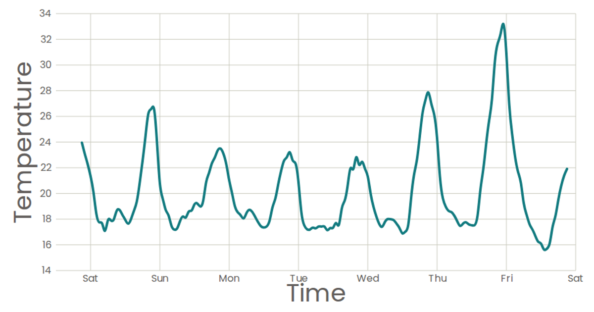
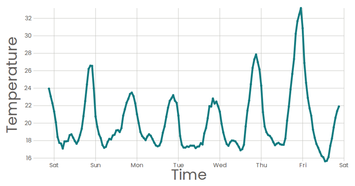
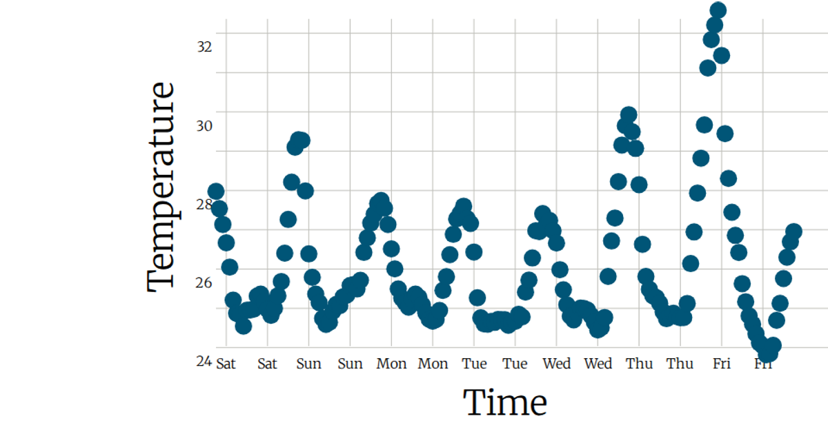
A line chart displays temperature readings over time, with each data point marked by a circle and the line connecting them. The chart uses a React state hook to load the data from a CSV file via D3's `csv` utility. Time is formatted on the x-axis using `timeFormat`, while linear scaling handles temperature on the y-axis, with axes and marks rendered as SVG elements.
AI-generated descriptionA program that loads in some data about CSS named colors using D3 utilities, and uses React state to keep track of the data.
MIT Licensed




Comments
Sign in to join the discussion.