🌍 Public
NEW CHART BEBE
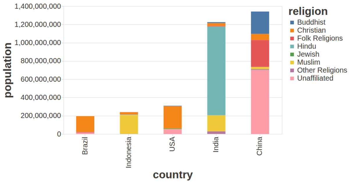
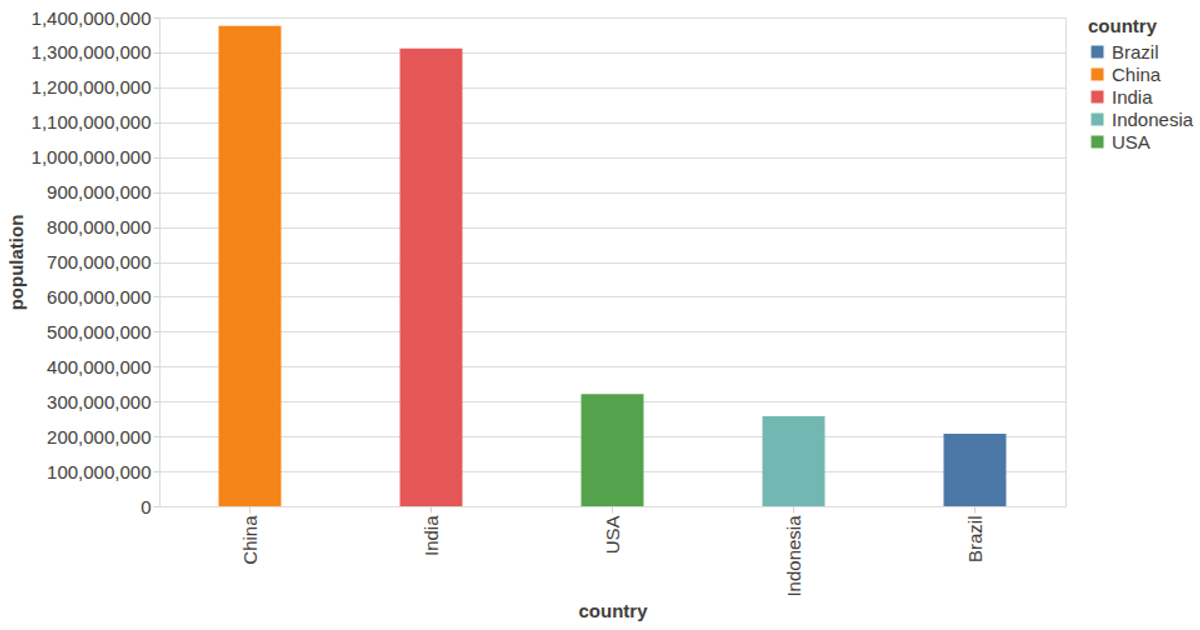
A bar chart displays population figures for countries, sorted by value, with a tooltip revealing each country’s exact population on hover. The visualization uses Vega-Lite 4 and the vega-lite-api to define the bar marks and encoding, while D3’s `csv` loader fetches data from a 2015 country population CSV hosted in a GitHub Gist. Custom axis and label styling via a config object improves readability against a dark theme.
AI-generated descriptionA visualization constructed using the vega-lite-api.
COUNTRY CHART BEBE
The data shown here comes from the UCI Machine Learning Repository: Auto MPG Data Set, via Gist: Scatter Plot with Menus.
MIT Licensed



Comments
Sign in to join the discussion.