🌍 Public
Area chart
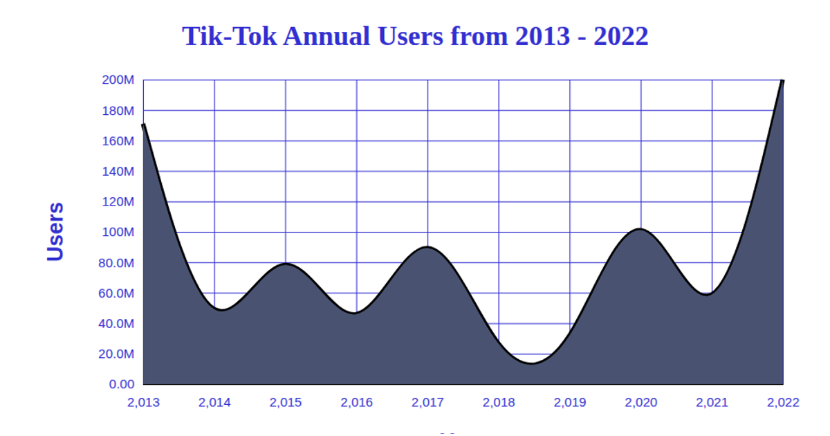
This area chart visualizes the average likes for TikTok accounts from 2009 to 2019, using a smoothed curve to show trends over time. The SVG rendering uses D3 v5 APIs including `scaleTime`, `scaleLinear`, `area`, `line`, `curveBasis`, `axisLeft`, and `axisBottom` to generate the chart. The visualization combines a red line with a light blue filled area beneath it, with labeled axes for Account and Likesavg. Data is loaded from a remote CSV file and parsed before rendering.
AI-generated descriptioncombined line and area charts
MIT Licensed


Comments
Sign in to join the discussion.