🌍 Public
Tw & T
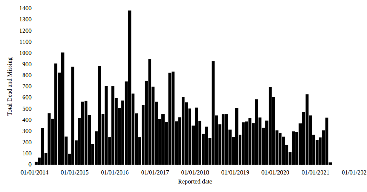
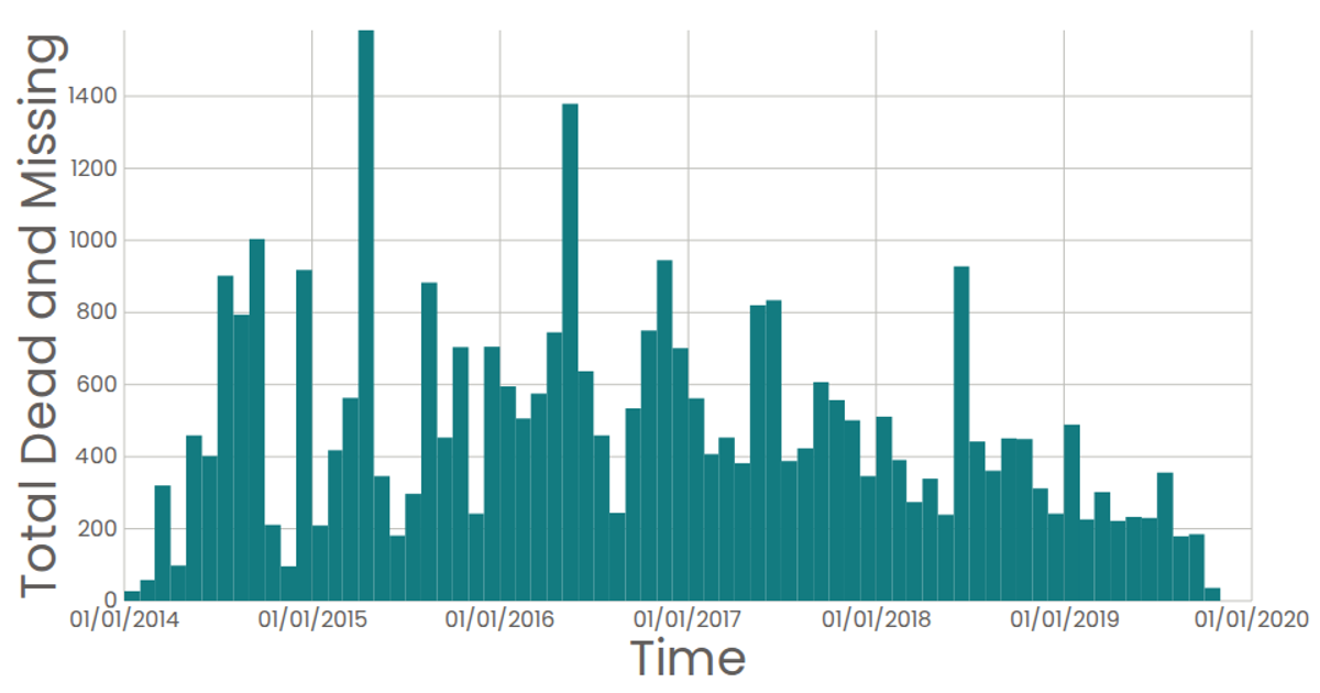
This interactive visualization presents a date histogram of the monthly sum of dead and missing migrants from the Missing Migrants Dataset. The chart uses SVG rendering with React, and employs d3’s `bin` and `sum` functions to aggregate the data into monthly totals. The d3 time scale handles the x-axis, while a linear scale maps the count of casualties on the y-axis. Clicking on a bar displays a tooltip with the precise monthly figure.
AI-generated descriptionA date histogram showing the sum total dead and missing migrants for each month.
Data from the Missing Migrants Dataset.
MIT Licensed




Comments
Sign in to join the discussion.