🌍 Public
Lilly Ice-7 Line chart
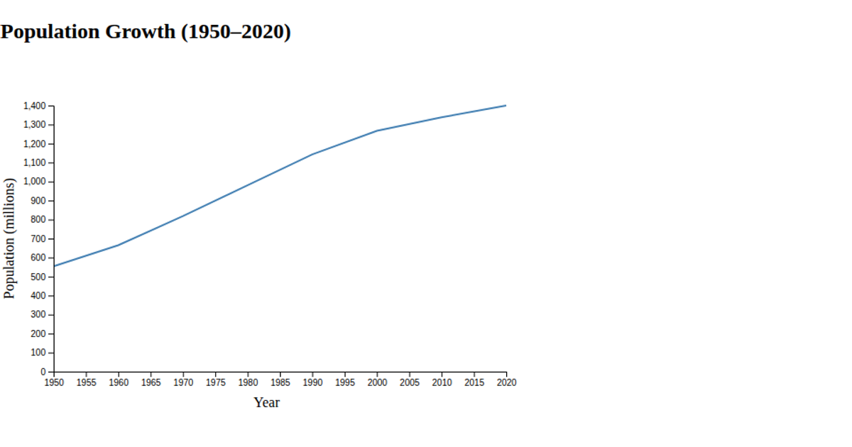
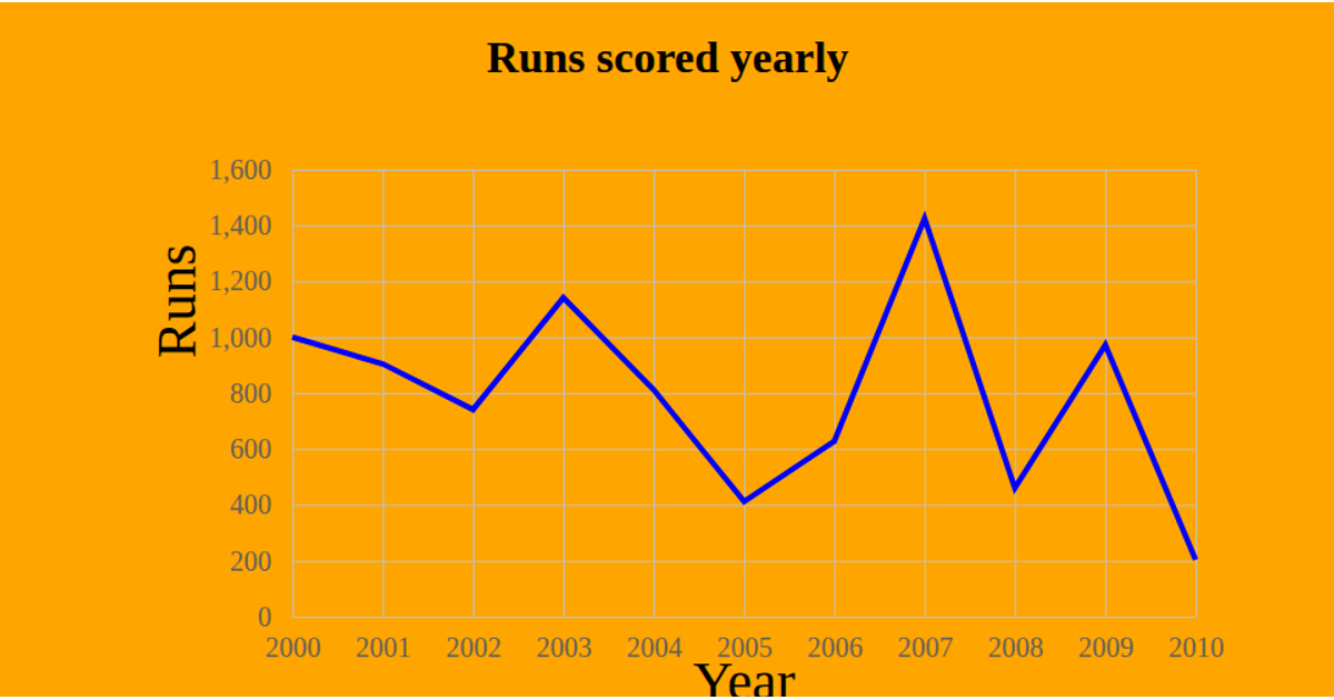
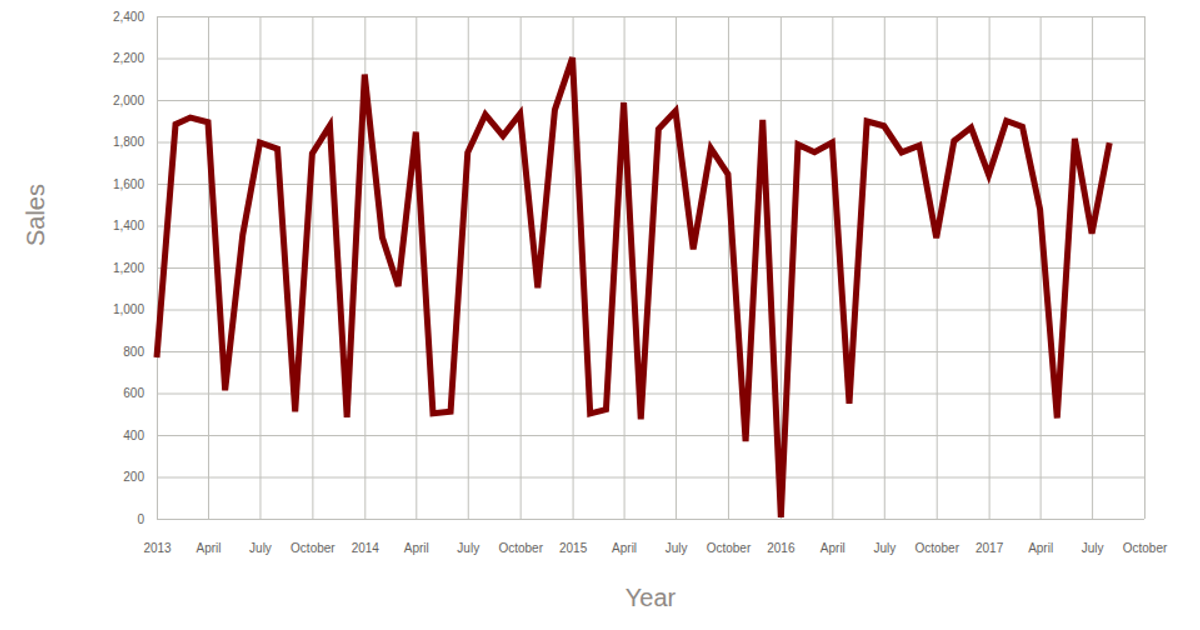
This line chart visualizes the relationship between year and births using a smooth curve. The chart displays the data with labeled axes for "Year" and "Births," applying a basis curve to the line path for a flowing appearance. Built with D3 v5, it uses `scaleLinear`, `axisBottom`, `axisLeft`, and `line` with `curveBasis` to render the SVG graphic. The dataset is loaded from a CSV file hosted on GitHub Gist, and the code includes methods for selecting SVG elements, computing extents, and appending axis labels and a title.
AI-generated descriptionThis line chart shows one week of temperature (in degrees Celcius) in San Francisco. The data comes from Data Canvas - Sense Your City.
Made in this video:
MIT Licensed




Comments
Sign in to join the discussion.