Fork of Hello VizHub
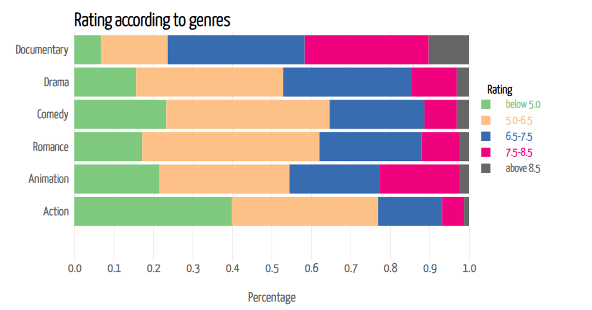
This stacked bar chart shows the percentage distribution of movie ratings across different genres, with each bar segment representing a rating category from "below 5.0" to "above 8.5." Hovering over a segment reveals its exact percentage via a tooltip. The visualization uses D3 v7 with `d3.stack()` to create the stacked layout, `d3.scaleBand()` for genre positioning, and `d3.scaleLinear()` for percentage values. Data comes from a CSV file loaded dynamically, rendered as SVG with custom styling and interactive mouse events.
AI-generated descriptionThe impact of genre on movie ratings
This stacked bar chart gives the percentage of each rating level within different movie genres. The aim is to show the impact of genre on movie ratings. When the mouse hovers over each bar, you can see pop-ups of accurate percentage of each rating level within each genre. Total percentage is 1, representing 100%.




Comments
Sign in to join the discussion.