🌍 Public
Sample1
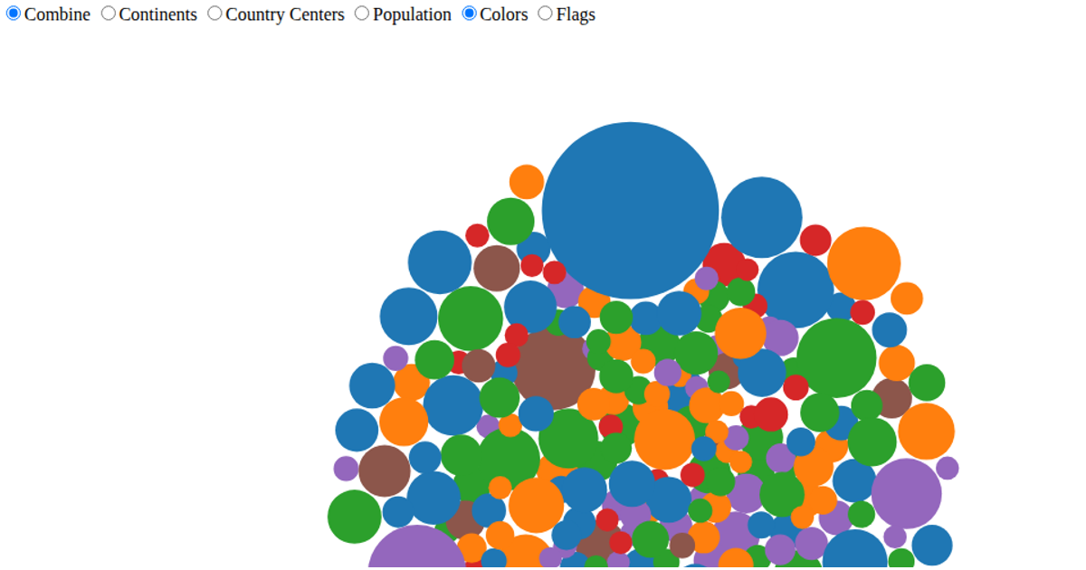
A bubble chart displays the world's most spoken languages, with circle positions and sizes encoding total speakers and native speaker counts. Ten languages load sequentially with animated growth, and hovering enlarges a bubble while showing its name in a tooltip. The visualization uses D3 v7 selections and transitions to animate circle radii, with an SVG rendering on a light green background. Data is embedded in the source as static objects.
AI-generated descriptionWorld Languages
MIT Licensed




Comments
Sign in to join the discussion.