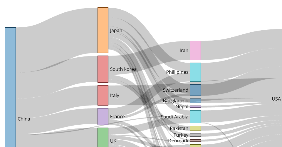
This visualisation was implemented to show the rate of spread between countries in the early stages of the outbreak. as we can see in the sankey diagram.
From analysis we can see that the provinces china were the carriers of the virus to the rest of the world. which led to secondary travel to new places such as europe and australia to spread it further. to parts of America and Africa.
This visualisation was made for teh final project submissioin of teh data visualisation project.
MIT Licensed