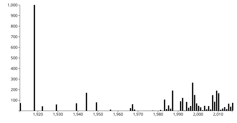
The data set I chose doesn't make sense to be displayed in a scatter plot so I made it into a bar
chart instead. The outliers make it look ugly.
The data in this set represents the total deaths related to different categories of national disasters since the early 1900s.