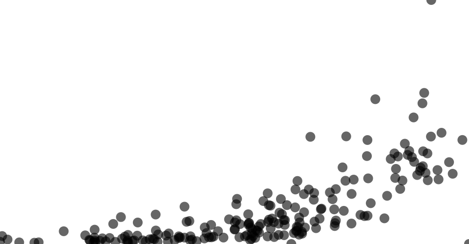
A simple scatterplot of the HDI dataset: https://gist.github.com/smcavey/5f819b6d6a270c6de339532a592399d4 Comparing mean life expectancy at birth in the year 2021 (x) vs. gross national income per capita in the year 2021 (y). Pretty clear trend. Added opacity so its easier to visualize dense clusters. Information on the outliers would be nice, such as using a mouse hover to see the country name
MIT Licensed