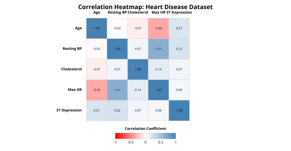
Correlation Heatmap Visualization
This visualization shows the correlation matrix for numeric variables in the heart disease dataset. Each cell represents the correlation coefficient between two variables, with:
- Red colors indicating negative correlation
- Blue colors indicating positive correlation
- White indicating no correlation (value near 0)
Features
- Interactive heatmap with hover tooltips showing correlation values and descriptions
- Clear axis labels with readable variable names
- Legend with descriptive title
- Improved text contrast for better readability
Variables
- Age: Patient age
- Resting BP: Resting blood pressure (mm Hg)
- Cholesterol: Serum cholesterol (mg/dl)
- Max HR: Maximum heart rate achieved
- ST Depression: ST depression induced by exercise relative to rest
MIT Licensed