First Visual — NY Automation Risk (React + D3)
A fork of Curran Kelleher’s VizHub demo:
Original scaffold:
https://vizhub.com/curran/basic-scatter-plot-with-react-d3
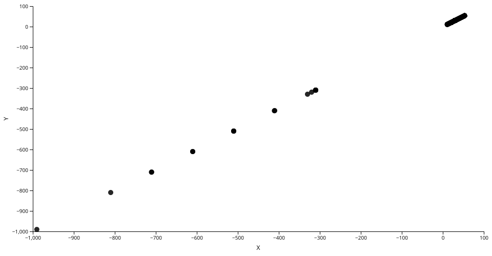
This “first visual” shows a rough scatter plot using New York occupation data:
- X: Probability of automation (0–1)
- Y: Employment in New York (count)
- Each dot = one occupation (SOC/Occupation)
It’s intentionally minimal—just enough to get real data on the screen.
Dataset
- File:
data.csv(rename your CSV to this for simplicity) - Columns (expected):
SOC— occupation codeOccupation— occupation titleProbability— automation probability (0–1)New York— employment count in NY
MIT Licensed