State Housing Appreciation Visualization
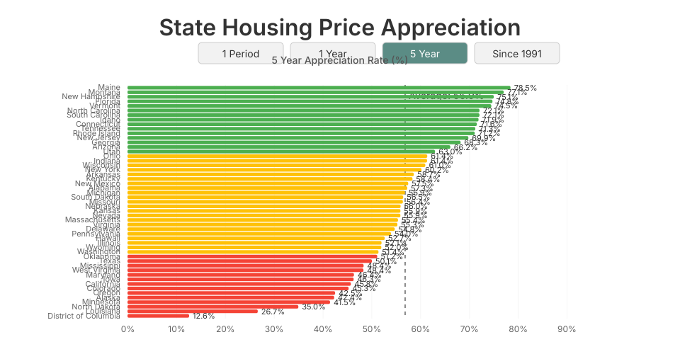
This visualization shows the 5-year housing price appreciation rates for all 50 states. States are ranked from highest to lowest appreciation, with bars color-coded based on their performance relative to the national average.
The data represents state-level housing price appreciation over different time periods.
MIT Licensed
Comments
Very nice!!!