Global Climate Impact Dashboard
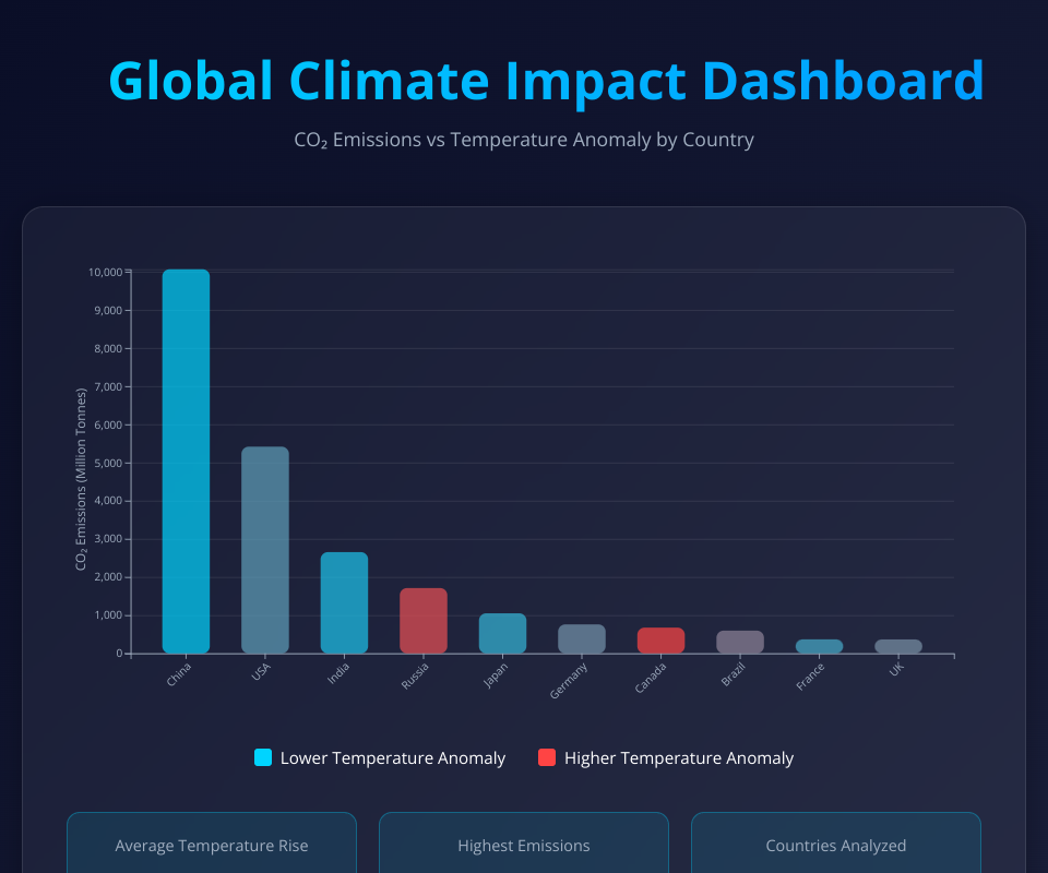
A stunning interactive data visualization showing the relationship between CO₂ emissions and temperature anomalies across major countries.
Features
- Interactive Bar Chart: Hover over bars to see detailed emissions and temperature data
- Color-Coded Visualization: Bars are colored by temperature anomaly (cyan to red)
- Smooth Animations: Bars animate in on page load with easing
- Statistics Panel: Quick stats on average temperature, max emissions, and data points
- Responsive Design: Works on various screen sizes
- Modern UI: Glassmorphism design with gradient backgrounds
Technologies
- React 19
- D3.js 7
- Modern CSS with gradients and backdrop filters
Data
The visualization displays CO₂ emissions and temperature anomalies for the top 10 emitting countries, providing insights into the correlation between emissions and climate impact.
MIT Licensed