Global Cost of Living vs Purchasing Power Analysis
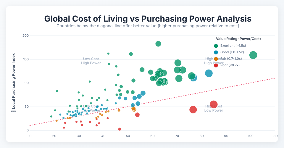
An interactive data visualization showing the relationship between cost of living and local purchasing power across different countries.
Features
- Interactive Scatter Plot: Explore data points by hovering and clicking
- Color-coded Value Ratings: Countries are colored based on their purchasing power to cost of living ratio
- Enhanced Tooltips: Detailed information on hover with formatted data
- Selection State: Click to select/deselect countries for comparison
- Trend Analysis: Diagonal reference line shows equal cost-to-power ratio
- Responsive Design: Adapts to different screen sizes
Understanding the Visualization
- X-axis: Cost of Living Index (higher = more expensive)
- Y-axis: Local Purchasing Power Index (higher = better purchasing power)
- Colors:
- Green: Excellent value (purchasing power >1.5x cost of living)
- Blue: Good value (1.0-1.5x ratio)
- Orange: Fair value (0.7-1.0x ratio)
- Red: Poor value (<0.7x ratio)
- Size: Larger circles indicate higher global rankings
Technology Stack
- React for component structure and state management
- D3.js for data visualization and DOM manipulation
- Modern CSS with custom properties and gradients
- ES6 Modules for clean code organization
Data Source
Cost of living data including rent, groceries, restaurant prices, and local purchasing power indices for countries worldwide.
MIT Licensed