Minard's Visualization of Napoleon's Russian Campaign
Overview
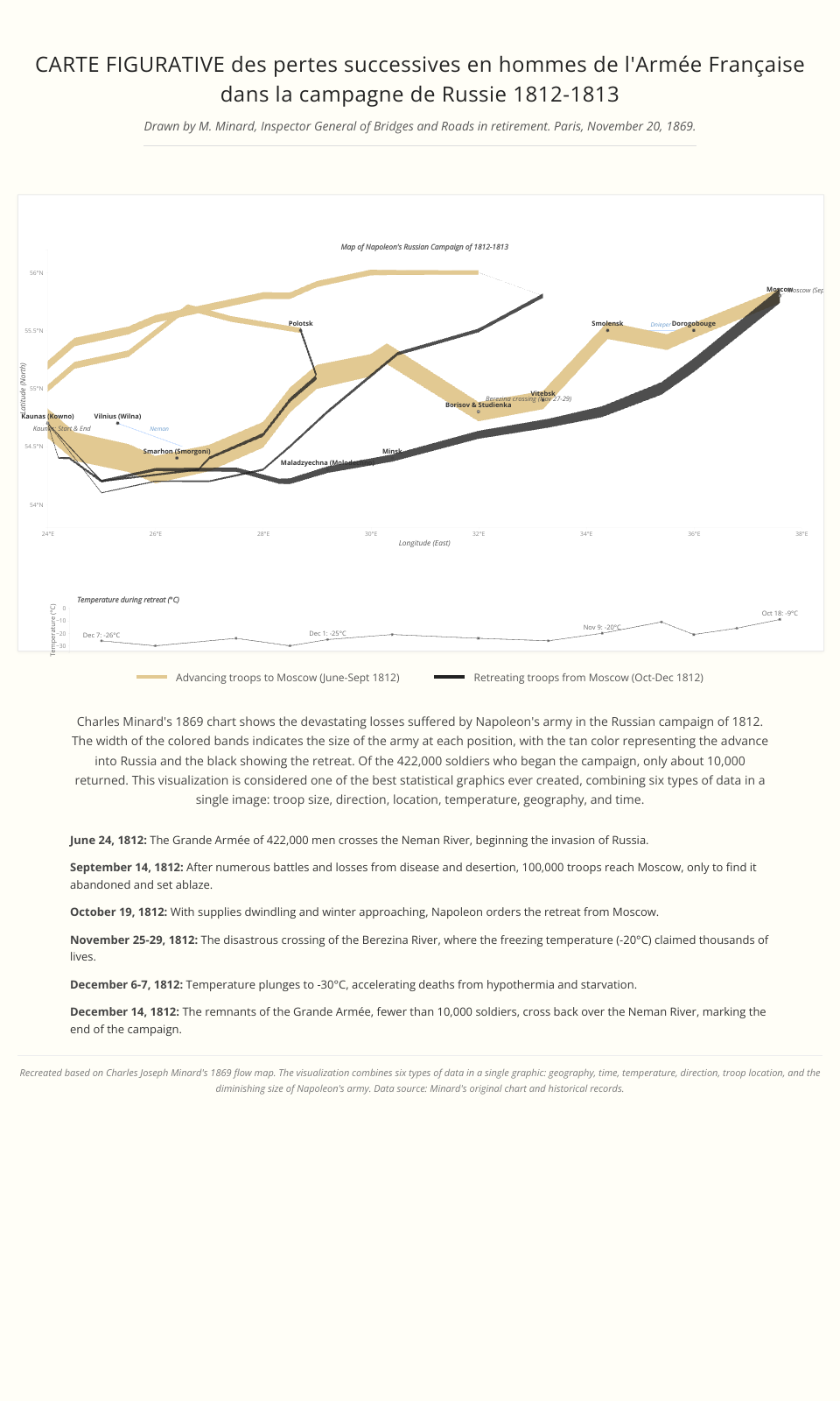
This project is an interactive recreation of Charles Minard's famous 1869 flow map depicting Napoleon's disastrous Russian campaign of 1812-1813. The visualization shows how Napoleon's Grande Armée was reduced from 422,000 to only about 10,000 men during the campaign.
Features
- Interactive visualization with tooltips showing troop sizes at different points
- Temperature chart showing the harsh winter conditions during the retreat
- Accurate geographic representation of the advance and retreat routes
- City markers with historical dates
- River crossings that were critical points in the campaign
Technology
- HTML/CSS for layout and styling
- D3.js v7 for data visualization
- Responsive design that works on different screen sizes
Historical Significance
Minard's original visualization is considered one of the best statistical graphics ever created, combining six types of data in a single image:
- Size of army (width of the flow)
- Location/geography (map coordinates)
- Direction of movement (advancing or retreating)
- Temperature during retreat (bottom graph)
- Crossing points of rivers
- Time/dates of key events
Data Sources
The data is based on Minard's original chart with some adjustments for accuracy based on historical records.
Usage
Open index.html in a modern web browser to view the visualization.
MIT Licensed