Airline Delays Visualization
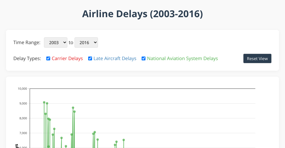
This interactive visualization displays airline delay data from 2003 to 2016, allowing users to explore trends in three types of delays:
- Carrier Delays
- Late Aircraft Delays
- National Aviation System Delays
Features
- Interactive time range selection
- Toggleable delay types
- Zoom and pan functionality
- Tooltips showing detailed delay information
- Responsive design that adapts to different screen sizes
- Statistical insights panel
Implementation
The visualization uses D3.js v7 for data binding, scales, and transitions. The code is organized into modular components:
index.html: Main structure and UI elementsstyles.css: Styling for the visualizationconfig.js: Configuration settingsdataService.js: Data loading and processingchartUtils.js: D3 chart utilitiesmain.js: Main application logic
Data Source
The data is sourced from a CSV file containing monthly airline delay statistics from June 2003 to July 2016. Each record includes counts for different types of delays.
Usage Instructions
- Use the time range dropdowns to select start and end years
- Toggle delay types using the checkboxes
- Hover over points to see detailed information
- Use brush to zoom into specific time periods
- Click "Reset View" to return to the original scale
Key Insights
The visualization reveals several interesting patterns:
- Seasonal variations in delays across all categories
- Correlation between different types of delays
- Long-term trends in airline performance
- Impact of major events on the airline industry
Future enhancements could include additional delay categories, weather correlation data, and airline-specific filtering.
MIT Licensed