US State Performance Map
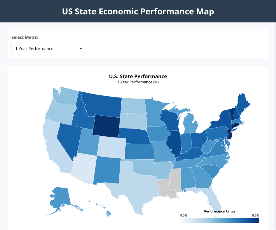
This project creates an interactive choropleth map visualization of economic performance metrics for US states using D3.js and TopoJSON.
Data
The visualization uses data from data.csv, which contains:
- State names
- Rank (1-49)
- Latest period performance (%)
- 1-year performance (%)
- 5-year performance (%)
- Performance since 1991 (%)
Features
- Interactive US map with color-coded state performance
- Multiple metrics selection (1-year, 5-year, Since 1991)
- Hover tooltips showing state metrics
- Detailed side panel for more information
- Responsive design
- Color legend
Technologies Used
- D3.js (v7)
- TopoJSON
- HTML/CSS/JavaScript
- ES6 Modules
How to Use
- Clone this repository
- Open
index.htmlin a web browser (using a local server due to ES6 module requirements) - Select different metrics using the dropdown
- Hover over states to see quick metrics
- Click on states for detailed information
Visualization Details
The choropleth map uses color intensity to represent different performance metrics, with darker blues indicating higher values. For metrics with negative values, a diverging color scale is used.
MIT Licensed