Napoleon's Russian Campaign Visualization
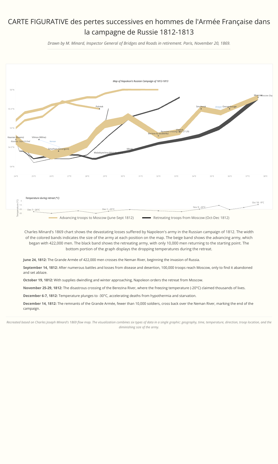
This project recreates Charles Minard's famous 1869 visualization of Napoleon's disastrous Russian campaign of 1812. The visualization shows the devastating losses suffered by the French army during both the advance to Moscow and the retreat, with a focus on accurate representation of the data.
Visualization Features
- Troop Movement: The width of the path is proportional to the number of troops
- Advance path: Colored in tan (#D2B48C) showing the army's march to Moscow
- Retreat path: Colored in dark gray (#333333) showing the devastating retreat
- Geographic Context: Cities and rivers are marked on the map
- Temperature Chart: Shows the dropping temperatures during the winter retreat
- Interactive Elements: Hover over cities and troop paths for additional information
- Linear Representation: Data is shown with straight line segments rather than smoothed curves, preserving the precise data representation
Historical Context
This visualization depicts one of history's most famous military disasters:
- June 1812: Napoleon's Grande Armée of 422,000 soldiers crosses into Russia
- September 1812: Only 100,000 troops reach Moscow
- October-December 1812: The retreat through the Russian winter decimates the army
- December 1812: Merely 10,000 soldiers survive to cross back over the Niemen River
Implementation Details
This visualization is built with modern web technologies:
- D3.js: For data visualization and geographical mapping
- Responsive Design: Scales appropriately for different screen sizes
- Tufte-inspired Styling: Minimalist aesthetic with high data-to-ink ratio
- Data Accuracy: Uses linear interpolation between data points rather than smoothed curves to maintain data fidelity
The implementation follows Edward Tufte's visualization principles, focusing on clear data representation with minimal chartjunk while honoring Minard's original concept.
Data Sources
The visualization combines several data elements:
- Troop movements with size information
- Geographical locations of cities and rivers
- Temperature data during the retreat
- Key dates and events of the campaign
Based on Charles Joseph Minard's original 1869 flow map, which is considered one of the finest statistical graphics ever created.