Airline Delays Analysis Dashboard
This interactive dashboard visualizes patterns in airline delays across different carriers, time periods, and delay types. The dashboard consists of multiple linked views that highlight various aspects of the delay data.
Features
1. Interactive Controls
- Year filter to focus on specific years
- Carrier filter to focus on specific airlines
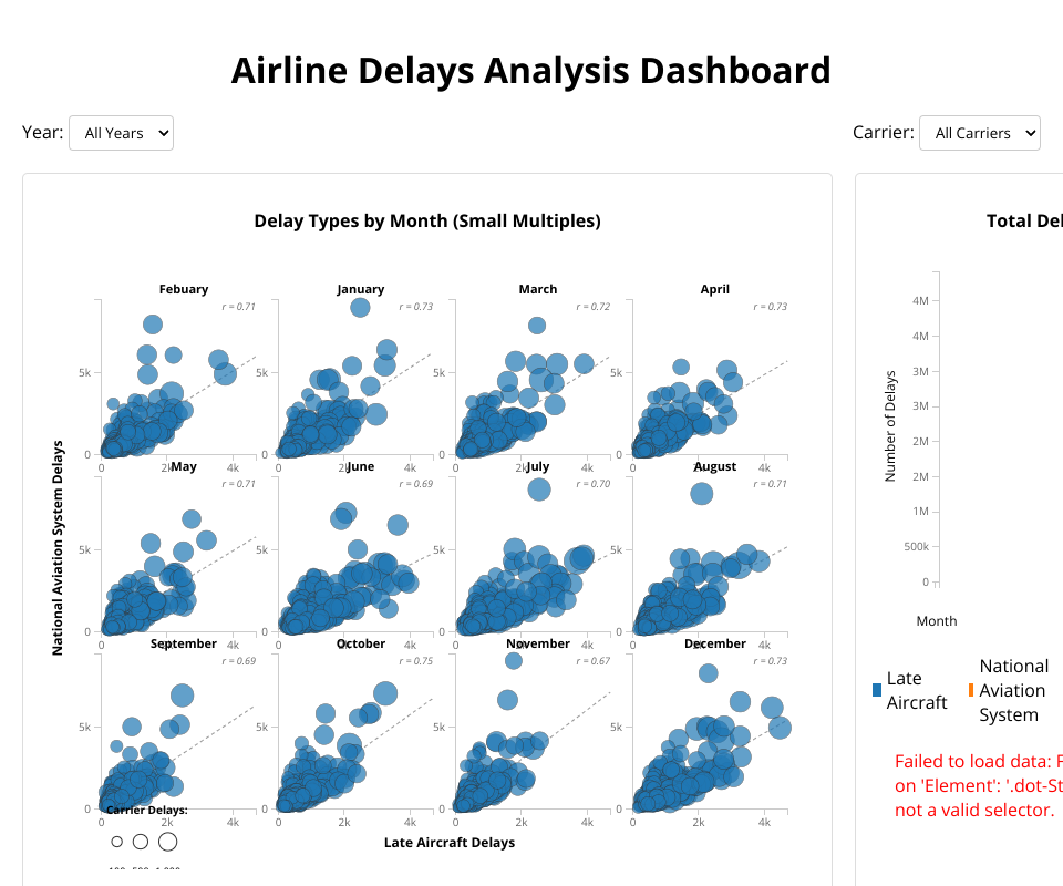
2. Delay Types by Month (Small Multiples)
- Shows the relationship between Late Aircraft Delays and National Aviation System Delays
- Carrier Delays encoded as bubble size
- Displays trend lines and correlation coefficients
- Small multiples pattern for monthly comparison
3. Total Delays by Type over Time
- Line chart showing the trend of different delay types across time
- Interactive legend to highlight specific delay types
- Helps identify seasonal patterns and trends in delays
4. Proportion of Delay Types by Carrier
- Stacked bar chart showing the breakdown of delay types for each carrier
- Reveals which carriers experience which types of delays more frequently
- Shows both absolute numbers and relative proportions
5. Average Delay Minutes by Carrier
- Bar chart showing the average delay duration by carrier
- Includes national average reference line
- Helps identify which carriers have longer vs. shorter delays
Visualized Data Dimensions
The dashboard visualizes multiple important aspects of airline delay data:
- Delay counts by type (Late Aircraft, National Aviation System, Carrier, Weather, Security)
- Delay minutes by carrier
- Temporal trends across months and years
- Correlations between different delay types
- Distributions of delays across carriers
Insights
This dashboard makes it easier to identify:
- Which carriers have more frequent delays vs. longer delays
- How different types of delays correlate with each other
- Seasonal patterns in airline delays
- How delay patterns have changed over time
- Which carriers have unusual delay patterns that warrant further investigation
Technical Implementation
Built using D3.js v7, the dashboard implements:
- Coordinated views with consistent visual encodings
- Interactive filtering with immediate visual feedback
- Small multiples pattern for comparative analysis
- Data aggregation and statistical calculations
- Responsive layout for different screen sizes
MIT Licensed