Pantheon - Tracking Cultural Output Through The Ages
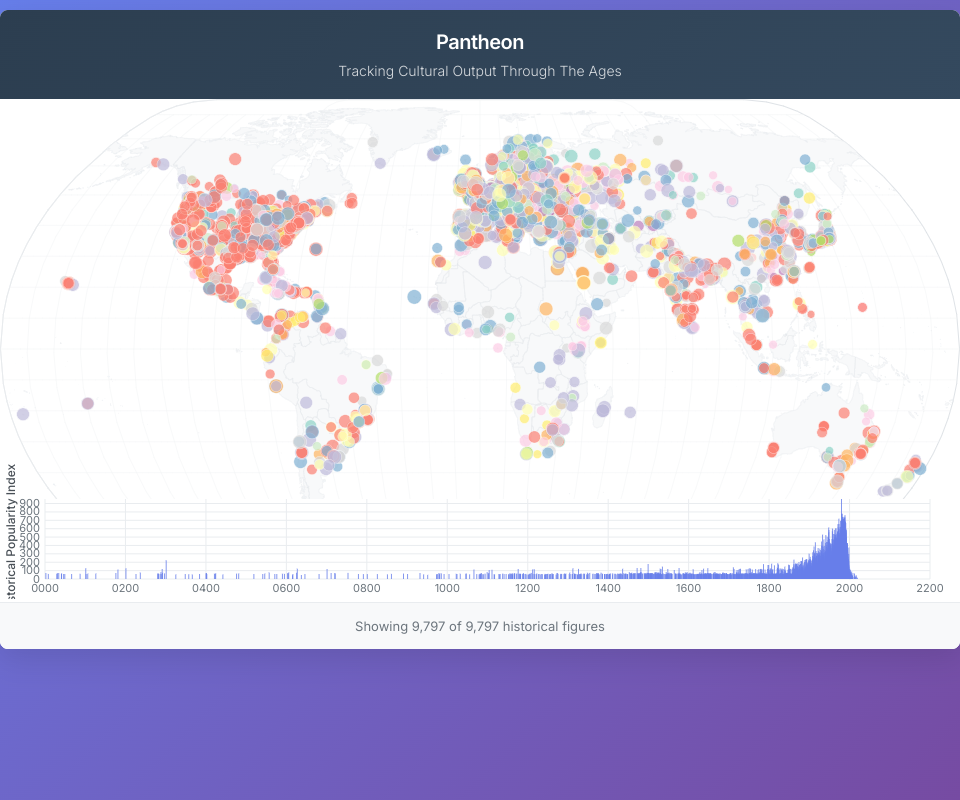
An interactive data visualization exploring the historical popularity and geographic distribution of notable women throughout history. This project uses the Pantheon dataset to create a bubble map visualization with temporal filtering capabilities.
Features
- Interactive World Map: Bubble map showing the birthplaces of historical figures
- Temporal Filtering: Histogram with brush selection to filter data by birth date
- Color Coding: Different colors for various occupations
- Responsive Tooltips: Hover to see detailed information about each person
- Smooth Interactions: Optimized rendering with React and D3.js
Dataset
The visualization uses a curated dataset of notable women from history with confirmed birth dates and locations, including their Historical Popularity Index (HPI) scores.
Technologies
- React 16.9
- D3.js v5
- TopoJSON for geographic data
- CSS3 for styling
Usage
Simply open the visualization and:
- Hover over bubbles to see person details
- Use the timeline brush at the bottom to filter by time period
- Observe how cultural output varies by geography and era
MIT Licensed