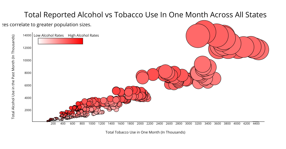
Visualization of alcohol usage and tobacco usage vs population size and alcohol usage rates from the CORGIS dataset made with D3. Implementation learned from D3 Graph Gallery.
Circle size correlates with population size and color intensity correlates with rate of alcohol usage per 1000 people.
Hover over dots to see values for that point.
MIT Licensed