A visualization constructed using the vega-lite-api. A scatter plot with D3. 2017 style.
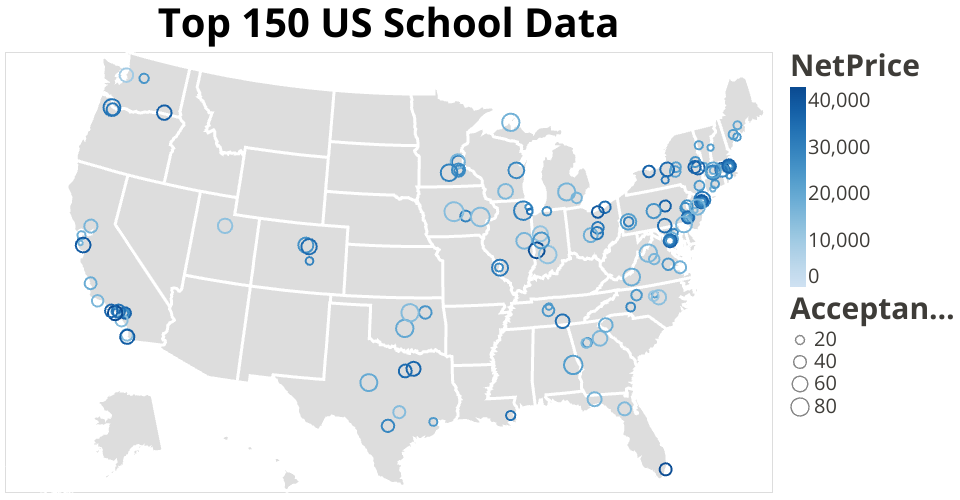
This visualization shows The top 150 US School Data.
It's designed to show top 150 school price and their acceptance rate, and locate them geographically on US map.
From this visualization, I leanrned how to use layer. That is load 2 dataset into on visualization. Also, I leanrned to use api to load US map, using the US map url api dataset to create a layer of US map. It's a json file referenced in this visualization.
Questions I can't figure:
- The circles in my map aren't very clear, I can't make it bigger.
- The default color from light blue to dark blue showing the price is also not very clear. I wonder if I can make it from blue(low price) to red(high price).
- Also, I wonder if I can make price ranges and throw them into bins, then the price can be an ordered catogory.
MIT Licensed