*Per 100,000 habitants
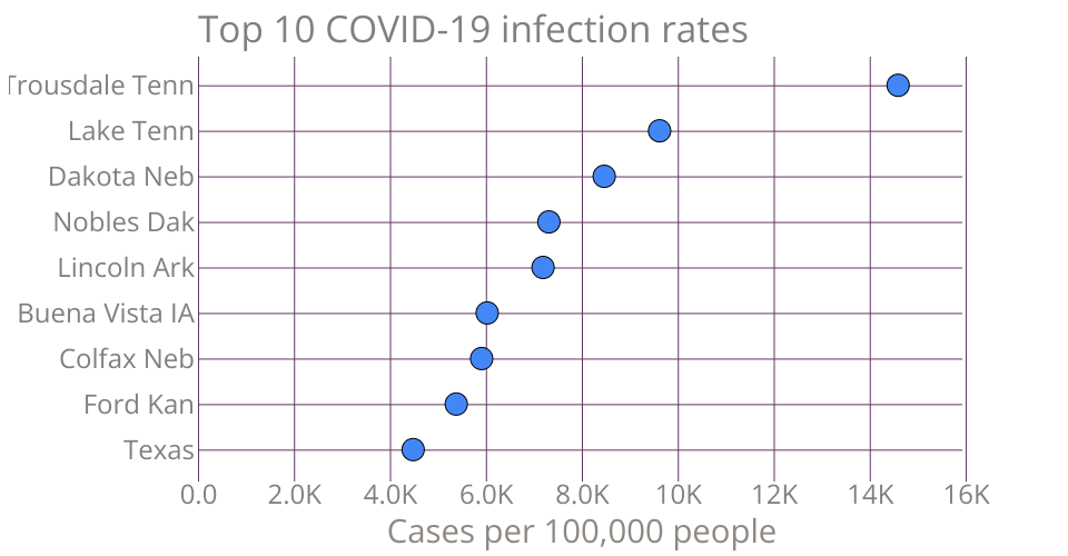
This bar chart was constructed using data from Elflein (June, 2020) Rates of coronavirus (COVID-19) cases in the most affected U.S. counties. Retrieved from https://www.statista.com/statistics/1109053/coronavirus-covid19-cases-rates-us-americans-most-impacted-counties/
MIT Licensed