A scatter plot of tobacco control data.
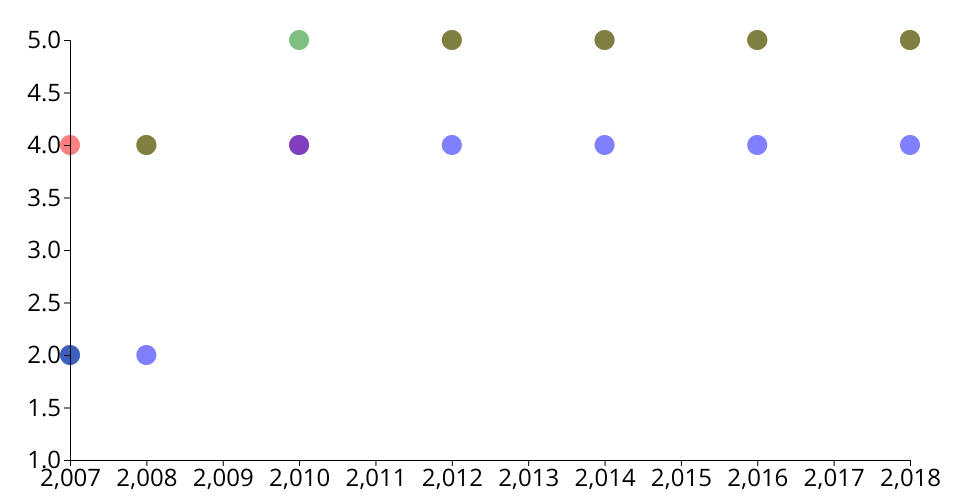
This scatter plot is to show that tobacoo control overview for three countries reported by MPOWER from 2007 to 2018.
Original data resource is WHO Global Health Observatory data repository, and I have uploaded it to a gist link on Github.
X axis is year, from 2007 to 2018.
Y axis is score of tobacco control by warning about the dangers of tobacco. The higher score means more powerful action of warning dangers of tobacco.
- 1 = Data not reported
- 2 = No warning or warning covering <30% of pack surface
- 3 = ≥30%* but no pictures or pictograms and/or other appropriate characteristics
- 4 = 31%–49% including pictures or pictograms and other appropriate characteristics**
- 5 = ≥50%* including pictures or pictograms and appropriate characteristics.
Here I selected three countries: Canada, United States of America and Mexico. Here is a trend that all 3 countries improve the power of warning about the dangers of tobacco to reach a better tobacco control since 2007.
*This is a part of week 3 assignmnet: Visualize your Data
MIT Licensed