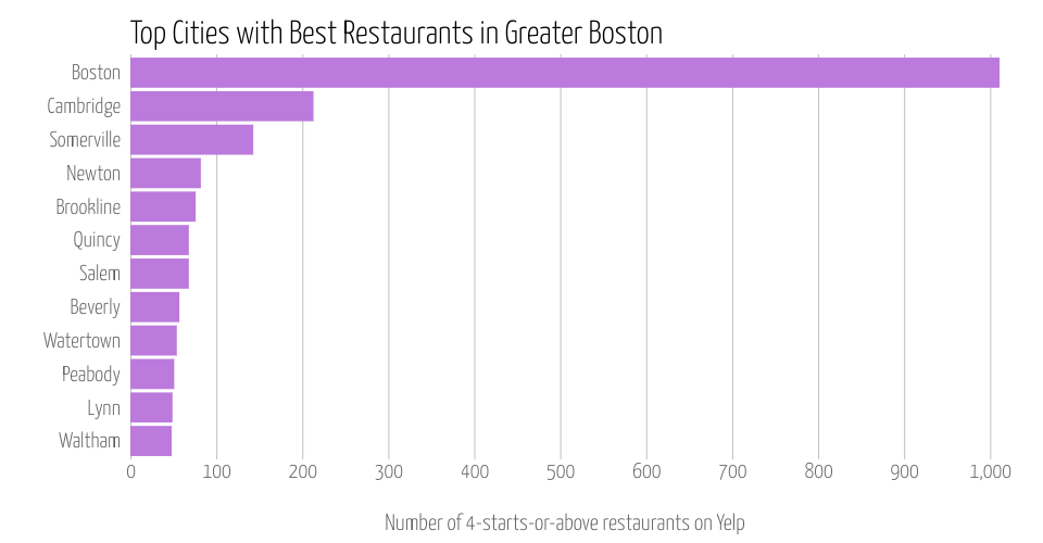
Bar chart of Yelp data: top cities
The original dataset is from public Yelp dataset.
The data used for this visualization is filtered on top-rated restaurants in Greater Boston (GB) area. Top-rated restaurants are defined as 4 stars or above.
This graph shows the top 10 cities with best restaurants in GB.
X axis is the number of best restaurants
Y axis is top 10 cities.
*This is a part of week 4 assignment: Create a Visualization that's Not a Scatter Plot
MIT Licensed