
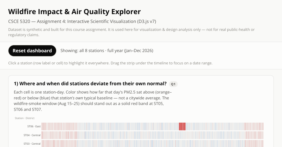
Wildfire Impact & Air Quality Explorer
CSCE 5320 — Assignment 4: Interactive Scientific Visualization (D3.js v7). Muhammad Zubair Hasan.
Three linked views over one year of synthetic urban sensor data (8 stations, 11,680 readings):
- Deviation heatmap — each station-day colored by how far PM2.5 sat above or below that station's own baseline. The August wildfire-smoke episode shows up as a solid red block at ST05, ST06 and ST07.
- Winter-vs-summer slope chart — which stations stay elevated year-round.
- NO2 vs. PM2.5 scatter — separate trend lines for normal days and wildfire-smoke days.
Interactions: click a station (heatmap row or cell) to highlight it in every view · drag the strip under the heatmap to filter by date range · hover any mark for details · Reset dashboard clears everything.
The dataset is synthetic and was created for the course; it is not for real public-health or regulatory claims.
MIT Licensed