
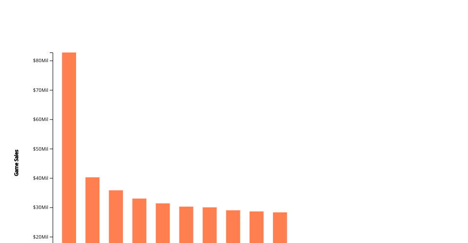
This is a scatter plot chart representation of Eggnog and Buttermilk fluid sales from 2000 to 2017. The milk is measured in millions of pounds of milk. This representation used d3 to visualized it. Reference used was from Professor Alark Joshi's Bar Chart Skeleton for aid in visualisation. Coral or orange represents eggnog while green represents buttermilk
Link to original data set: https://github.com/rfordatascience/tidytuesday/blob/master/data/2019/2019-01-29/fluid_milk_sales.csv
Link to altered data set: https://gist.github.com/jtchan2/0c0f6c4bebf2a874edc6cd59ed2093ad
MIT Licensed