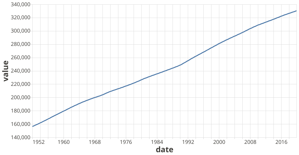
This a line plot shows how population changed over time. This visualization shows US Population Time Series Data. X axis tells the year range and y axis tells what population looks like for each year.
MIT Licensed
This a line plot shows how population changed over time. This visualization shows US Population Time Series Data. X axis tells the year range and y axis tells what population looks like for each year.