Image
Code

Warfarin BarChart with Custom Axis

gregstaity

Last edited Nov 29, 2019
Created on Nov 29, 2019
Forked from Warfarin BarChart

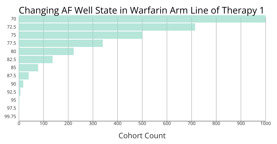
This bar chart shows how the AF Well Population cohort changes across several years in the PRIME model.

MIT Licensed