
Built with D3.js + React
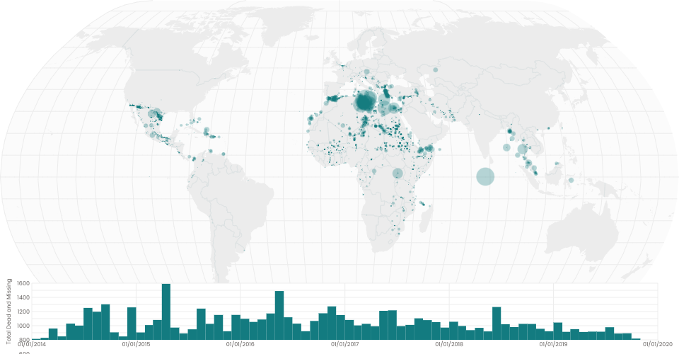
This is a interactive visualization of the number of people who perished while migrating to another destination. Points on the map indicate the approximated coordinates where these individuals passed.
Reasons for their migration could be to seek economic opportunities, join families, or to escape conflict, terrorism, human rights violations in their home countries.
Brushing effect is added to the bar chart, to visualize missing migrants data over time on the world map.
To use brushing effect -- select a starting point inside the bar graph then drag to a desired end point. Once a range is established, drag the rectangle across the bar chart to visually see locations of missing migrants over time.
Data sourced from United Nations missing migrants project.