My HackerRank Line Chart

I would like to ask for reviews on this visualization that I was working on. It is a line chart that shows my rank progression as I solve algorithms with JavaScript on HackerRank.

Here are some points that I had in mind while making this viz:

  • The font face and green color were taken from HackerRank’s page.
  • Step curve to differentiate the days in which I actually solved a problem and ranked higher.
  • Tooltip-like component that snaps to the closest point to the mouse position and shows the corresponding date and rank.

It is a simple project, but I want to improve it as much as possible from both design and data viz perspective. So, what do you think?

This is a fab viz Waseem! It’s neat and the tooltip implementation is well done. Do you have a portfolio page? It’s worth featuring on it.

I’d suggest linking to your profile on the Viz - add a link to your profile on “My Rank” perhaps?

1 Like

Thank you Sriram! Actually, I thought of the same idea. It’s cool that you thought so, too.

I only made a personal blog so far. A project portfolio is definitely a next step for me.

@waseem-medhat This is really great work! It’s pretty much perfect, aside from a few minor nits that are more in the realm of design than visualization. I would suggest looking into the following:

  • There are many fonts styles in use. Try to use fewer. For example, the style used for “JavaScript - Problem Solving” can be made to match that of the axis ticks and the month text of the hovered text (both in terms of font size and color)
  • White space feels a bit unbalanced. This is largely personal preference, but perhaps the ticks could be made closer to the axis grid lines, and the white space above the title and below the bottom ticks could be reduced.
  • Aligning the “My Rank” text with the edge of the tick grid would give a more polished feel.

For this sort of design stuff, I would highly recommend this YouTube playlist “Refactoring UI”.

1 Like

@curran, thank you so much for these suggestions and the playlist!

I agree with these points, except that I don’t know how I can align the title with the tick grid because that position will keep shifting as I add more data. The text is actually aligned with the edge of the left margin of the viz.

How do you think I can overcome that? Maybe boxing the (inner) viz with a border or a slightly off-white background that separates it from the margin? Or instead of a full border, just the two axis lines. :thinking:

Aligning the text to the left margin of the viz is perfect.

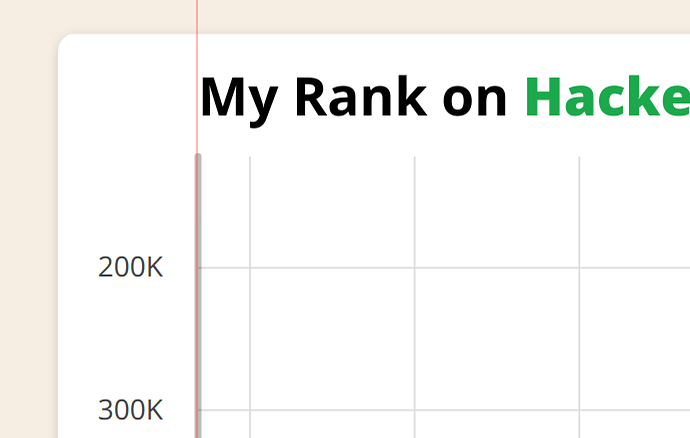
This is what I see visually. Even though the text may be “aligned” from the code perspective, there seems to be a bit of extra space, visually, to the left of the “M”. I’ve added a red line so the difference can be seen. You may need to add a hard-coded X offset in pixels to achieve the visual alignment. Ideally the left side of the M would touch that red line.

2 Likes

If I had to guess right now, I’d say there’s some padding which should’ve been zero. I’ll look into it when I get the chance.

Update: it wasn’t the padding, and I had to hard-code those couple of pixels like you said.

2 Likes