How to visualize data flows between applications? Recommendations?

Dear community,

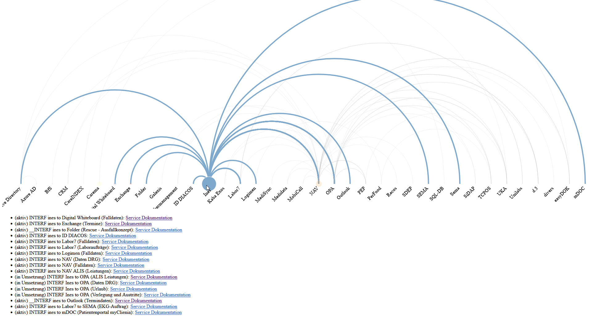
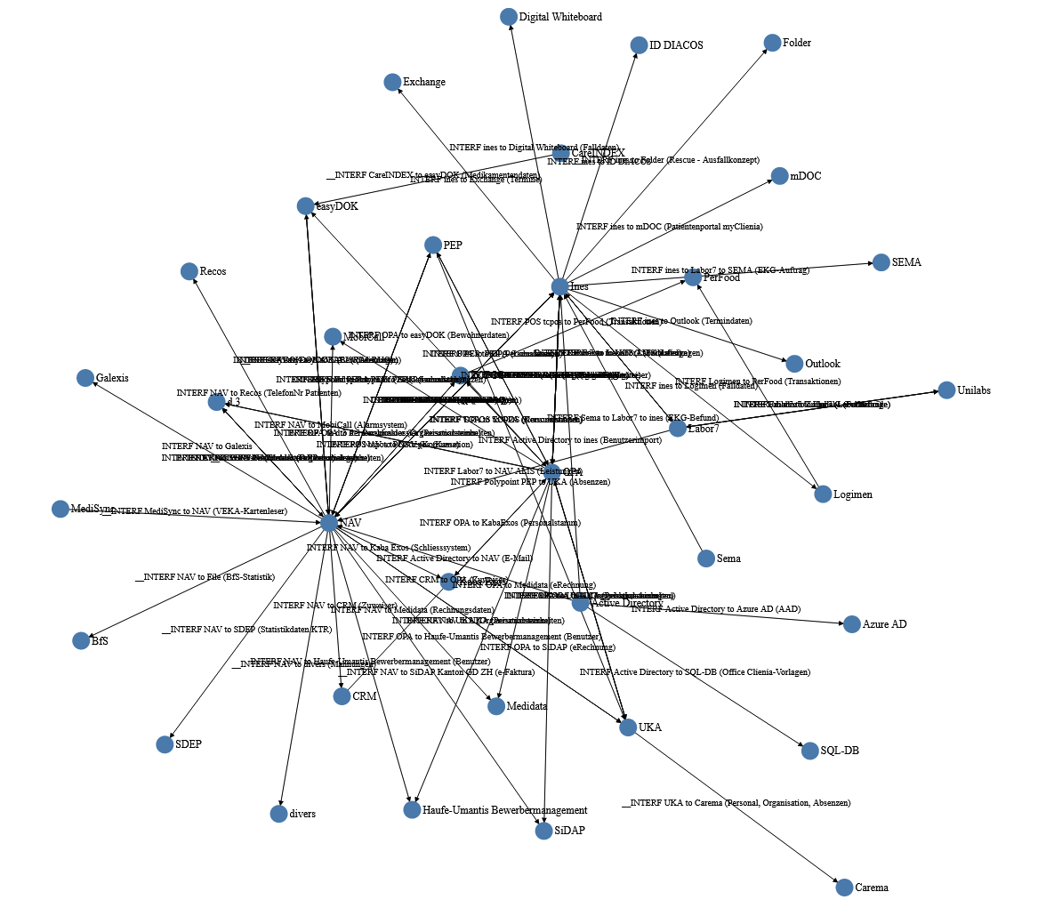
in our company, I am responsible for all the interfaces between our applications. I work for a hospital and we have approx. 40+ applications, which exchange data between each other. (e.g. the clinic information system provides data to the financial application, so that invoicing is possible)

In total, there are 70+ of those interfaces.

I would like to have an overview, which application is exchanging data with witch other applications. Each application can be source or target at the same time.

I played around with a force-directed network graph, but I am not very happy with it.

What is your recommendation? Is there a better graph to visualize my needs? (I had a look at the Arc and Chord diagram, but those aggregate the information too much - if I understood them correctly?)

Or should I focus on including filters and colours in my existing diagram?

Any help is very much appreciated!

Chris

2 Likes

Amazing!

It looks like the force directed layout may not be a good fit for your needs. I would suggest to look into the Sugiyama family of layout algorithms.

Check this library

Also this one may be good, but is unfortunately not maintained:

Also this one may be good:

I don’t have any examples of these yet in VizHub, but would love to add some and figure out how to use these. If you do have a breakthrough, please share.

Good luck!

1 Like

Hi @curran,

thank you for all those links. I am not very good a coding. Apologies for doing this with the help of a very known AI. :grimacing: :flushed: :disappointed: (My code is probably a mess…)

I played around with the ARC-diagram. I took the official example and started from there. This seems to be promising.

I added the list of links at the bottom of the diagram. This is done with the mouse-over. Whenever a user hovers over the node, the list is changed to the links with the current node as a source. I added the URL to our documentation in Confluence and the current state of the interface.

In addition, I made the line thickness dependent on the amount of links between two nodes.

Those two enhancements already allow me to get a quick overview on our infrastructure.

open issues:

  • The line thickness disappears as the mouse over changes and does not come back.
  • The source data for all this comes from a csv out of Jira. I use Talend Open Studio for Data Integration to transform the data into the necessary structure. I need to redesign my flow in Talend to adapt my data.json.
  • 3 of the labels to the node are cut off. I still have to figure out, how to give them more space or how to introduce line brakes.
  • Filters would be very nice. I have a couple of attributes on the links that could be used to focus on some aspects of our intrastructure.

In a couple of (sleepless) nights, I will get there… :laughing:

Chris

1 Like

I’m a beginner with nothing of value to offer here but I wanted to say your diagram right now is so cool. I love how the nodes are connected to the other applications. @schneich