This thread is for the video Datavis 2020 Episode 3 - Finding Visualizations.
Found a cool viz in the wild? Please share it here!

This thread is for the video Datavis 2020 Episode 3 - Finding Visualizations.
Found a cool viz in the wild? Please share it here!
From YouTube comments (Alan Wilson):
Good stuff. I also like Tableau Public’s Gallery. They post a new visualization every day. https://public.tableau.com/en-us/gallery/?tab=viz-of-the-day&type=viz-of-the-day
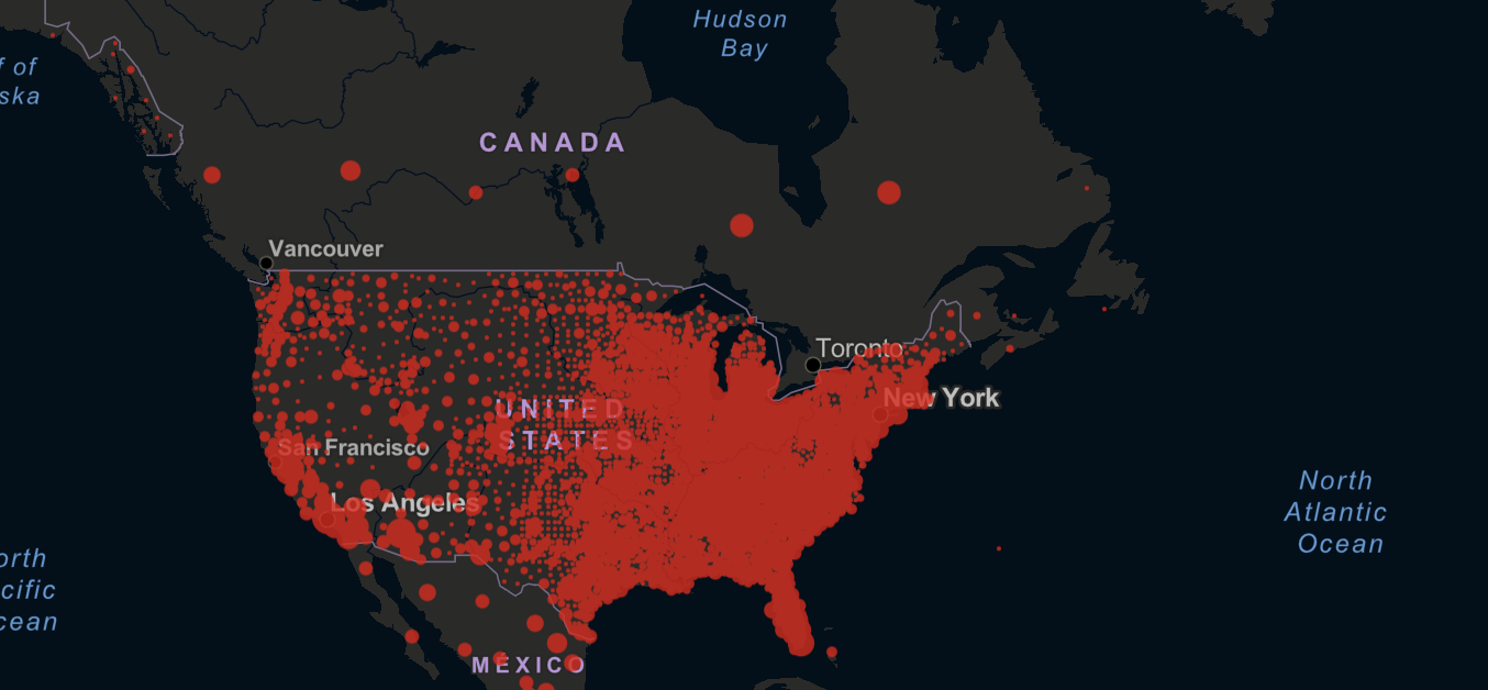
I the data visualizations that TheVerge and TheGuardian has been putting out in the last few years. But I have been looking at the Johns Hopkins University COVID-19 Dashboard a lot.
Yes! That’s become a very very hot and highly viewed site, since its inception. Lots of great work there.
One common critique of this is that it shows county level data for the US, but state level data for Canada and Mexico, so people end up interpreting that as “Wow there are so many more cases in the US than in Canada.”
I think this is dataviz. Windy is my go-to for wind, waves, and tidal forecasting while on the job. I’ve been making attempts at localized vizzes of tidal and wind flow for raceday purposes, but I’m still a bit of a noob. Hope you guys enjoy!
Very nice! Reminds me of