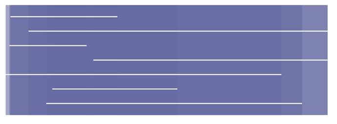
Copying discussion from Slack into here for future reference:
Try various values for mix-blend-mode https://developer.mozilla.org/en-US/docs/Web/CSS/mix-blend-mode That might get you closer.
To clarify, you want the overlapping region between 2 rectangles to end up as the same color as the overlapping region between 3 or more rectangles? And the overlapping regions should be different from the non-overlapping?
One idea: you could pre-process the data such that you compute the regions with only one vs. the regions with more than one, then visualize those regions with specific colors. This would not be relying on opacity or blending at all.
I just want the color intensity to be independent (as much as possible) from the dataset size.
Assuming I’m using fixed opacity (0.1) all the time… If I use a dataset of size 2, any overlap would still be a bit light in color. However, if I used a dataset of size 8, the area of overlap between the 8 rectangles (if it does exist) will be much darker. So, the maximum intensity that can be visually seen is dependent on the number of data points I have. This is that I am trying to minimize. – Waseem Mendhat
Ah I see. Maybe try making the original color lighter? And a fixed opacity. Like this:
  	.attr('fill', '#666ba2')
  	.attr('opacity', 0.6)
Then you can adjust the opacity depending on what you want to be full saturation, and adjust the color depending on how dark you want full saturation to look.
For example opacity of 0.6 ends up like this.

