A re-creation / reimagining of a classic graphic on color from "The Big Book of Dashboards" by Steve Wexler, Jeffrey Shaffer, and Andy Cotgreave.
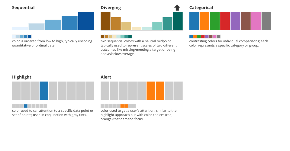
Color Scale Patterns in Data Visualization
This infographic demonstrates the five basic color-scale patterns used in data visualization:
Color Scale Types
- Sequential - Color is ordered from low to high, typically encoding quantitative or ordinal data
- Diverging - Two sequential colors with a neutral midpoint, used for scales showing two different outcomes
- Categorical - Contrasting colors for individual comparisons, each representing a specific category
- Highlight - Color used to call attention to specific data points, used with gray tints
- Alert - Color used to get user attention, using attention-grabbing colors like red or orange
Each pattern is illustrated with a mini bar chart, color swatches, and descriptive text to demonstrate the appropriate use case and visual encoding.
MIT Licensed