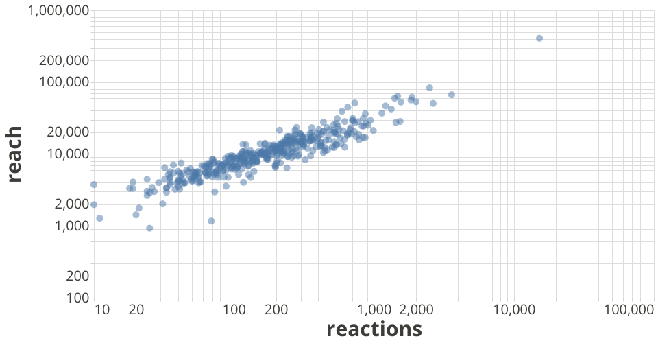
This variant of the original work by @Bizmundo shows how log scales can be used to get a better spread of the data (as well as tooltips).
This chart is a visualization of the freecodecamp facebook post data. The data used to plot this chart can be found on github.
MIT Licensed