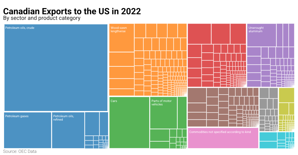
This visualization shows Canadian exports to the United States in 2022 using a hierarchical treemap layout. The data is organized by sectors, with individual products nested within each sector. The data and visualization idea come from Atlas of Economic Complexity: What did Canada export to the United States of America in 2022?
See also Gist containing the data.
Visualization Features
- Hierarchical treemap showing export values by sector and product
- Interactive tooltips with detailed information
- Color coding by sector
- Responsive layout that adapts to screen size
- Hover effects to highlight related items
Data Structure
The data is structured hierarchically:
- Top level: Total exports
- Second level: Sectors (e.g., Minerals, Agriculture)
- Third level: Individual products within each sector
Each product includes:
- Name
- Export value
- Share of total exports
- Product code
- Parent sector
Technical Implementation
Built using:
- D3.js for visualization
- Treemap layout for hierarchical data representation
- ResizeObserver for responsive design
- Custom tooltip implementation
How to Read the Visualization
- Each rectangle represents a product or sector
- Size corresponds to export value
- Color indicates the sector
- Hover over rectangles to see detailed information
- Related items are highlighted on hover
MIT Licensed