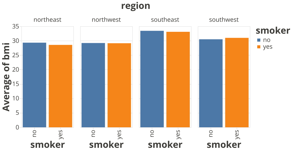
A fork of the same data visualized as a stacked bar chart.
When visualizing using a grouped bar chart like this, visual comparisons between the adjacent bars are much easier to make. This makes it easier to answer the question "Do smokers have higher or lower average BMI than non-smokers, and how does that vary by region?", as compared to the stacked bar chart.
MIT Licensed