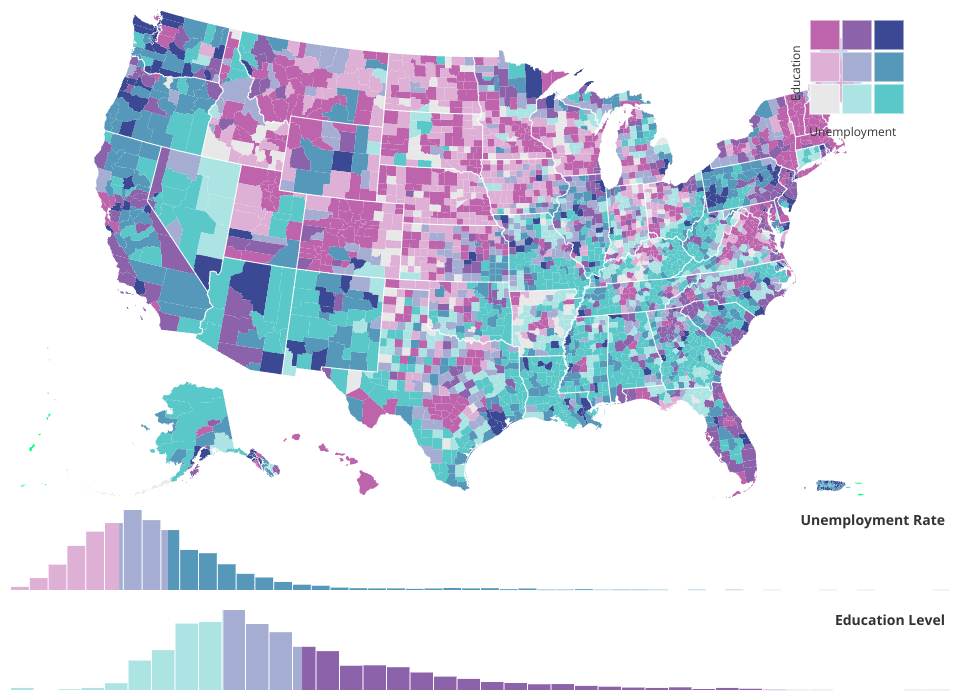
Bivariate Choropleth Map with Interactive Histograms
An interactive data visualization showing the relationship between unemployment rates and education levels across U.S. counties using a bivariate choropleth map with coordinated histograms.
Features
Bivariate Choropleth Map
- Displays U.S. counties colored by two variables
simultaneously:
- Unemployment Rate: Horizontal axis of the color scheme
- Education Level: Vertical axis of the color scheme (% of adults with bachelor's degree or higher)
- Uses a 3x3 bivariate color palette where:
- Purple shades indicate high education, high unemployment
- Blue-green shades indicate low education, high unemployment
- Gray shades indicate low education, low unemployment
- Pink shades indicate high education, low unemployment
Interactive Histograms
Two coordinated histograms display the distribution of:
- Unemployment Rate (top histogram)
- Education Level (bottom histogram)
Each histogram features:
- Brushing: Click and drag to filter counties by value ranges
- Bivariate coloring: Histogram bins are colored using the same bivariate scheme as the map
- Coordinated filtering: Brushing in one histogram filters both the map and the other histogram
Hover Interactions
- Hover over any county to highlight it in bright green
- The corresponding value appears in both histograms with a vertical indicator line
- Smooth animations provide visual feedback
Bivariate Legend
- Located in the top-right corner
- Shows the 3x3 color matrix
- Labels indicate the direction of increase for both variables
Data Sources
Unemployment Data (unemployment-x.csv)
- County-level unemployment rates
- Contains: County ID, State, County Name, Unemployment Rate
Education Data (education.csv)
- County-level education attainment
- Percentage of adults with bachelor's degree or higher (2018-22)
- Source: FIPS codes matched to counties
Geographic Data
- U.S. county boundaries from
us-atlas(TopoJSON format) - Loaded dynamically from CDN
- Uses Albers USA projection with territories support
Technical Architecture
Core Visualization Components
index.js: Main entry point, orchestrates all componentsmap.js: Renders the choropleth map with TopoJSONhistogram.js: Renders histograms with brushing and bivariate coloringbivariateLegend.js: Renders the 3x3 color legend
Histogram Sub-components
histogramBars.js: Renders histogram bins with maskinghistogramBrush.js: Implements brushing interactionhistogramBins.js: Creates bins from data (40 bins)histogramScales.js: Creates x and y scaleshistogramHoveredDatum.js: Displays hover indicatorshistogramLabel.js: Adds axis labelscolorLegendRects.js: Renders colored rectangles behind histogram bars
Data Processing
dataLoader.js: Loads and merges unemployment and education datacolorScales.js: Creates quantile scales for both variablesbivariateColorScale.js: Implements the 3x3 color matrix
State Management
stateManager.js: Manages interaction state (brushing, hovering)getUSAtlasData.js: Loads and caches geographic dataconstants.js: Configuration constants (dimensions, colors, margins)
Color Scheme
The bivariate color palette uses a 3x3 grid:
MIT Licensed