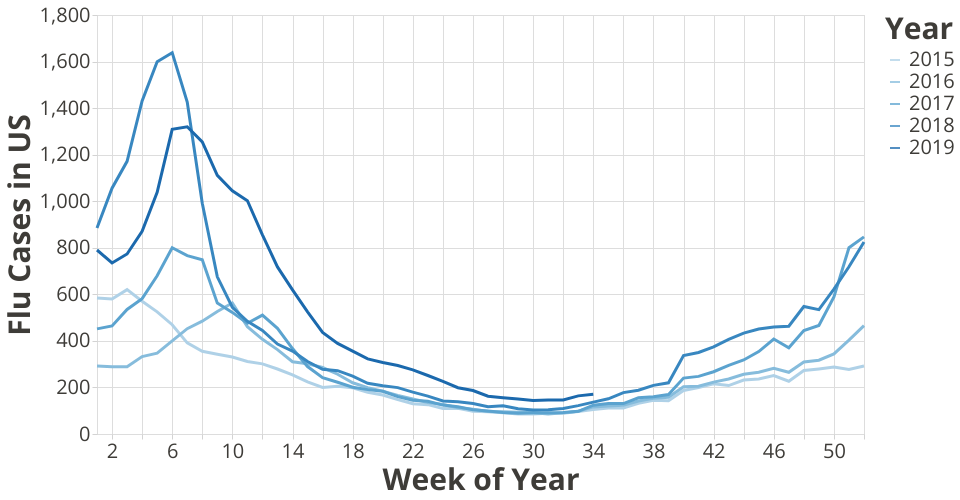
This variant of the original work by Yu Zhang demonstrates use of an ordered color encoding for an ordered field (year), which makes it easier to read the chart, because you can say "darker is more recent".
A visualization constructed using the vega-lite-api.
This graph shows the national ILI total cases annually. The curves from 2015 to 2019 to the present date are displayed. This plot achieves the visualization of the annual ILI total patterns in general, and also provide a direct comparison year-over-year. We can tell 2018 is the year with highest Flu cases in mid February time, while 2019 has a more stretched Flu season comparing to other years.
When interations are introduced for the visualization together with Choropleths Map, we can select the individual yearly curve and present the map for that given year. We can also select a region or state and present a different portion of the dataset here to see more localized patterns.
See Data on Gist: ILINet Flu Surveillance Data
The original data comes from the CDC FluView Interactive