Description
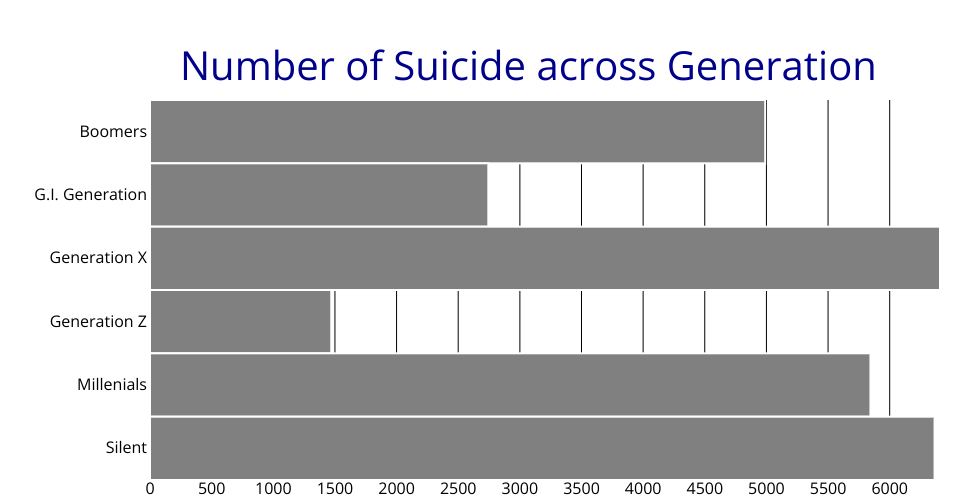
A program of bar charts that shows the suicide statistics versus demographic generation.
Viz Experience
My initial plan is to draw a stacked bar charts of suicide versus different age groups and changing with Year. However, I met two problems. The first problem is stacked bar charts are still beyond my capability in D3; the second problem is a statistical analysis tells me the number of suicide cases in different age groups in each year is the same (probably the reason lies in researchers used some sampling methods to get the dataset and they set getting the same suicide number in each age groups).
Thus I change the way to visualize. I simply draw a bar chart, but make some improvements than Curran's templates.
- Re-fill the color of bar, and add stroke to bars to classify each bar a little bit.
- Add title to the bar chart, and change the color to DarkBlue.
Questions and Answers
Questions: Can you catch which generation has the toppest number of suicide?
Answers: It's Generation X! (although Generation X is quite similar to Silent)
A little background knowledge
Generation X is the demographic cohort follwing the baby boomer and preceding the Millennials. Typically, generation X refers to birth year ranging from early-to-mid 1960s to the early 1980s.
Data Sources
Data: Suicide Rates Overview.