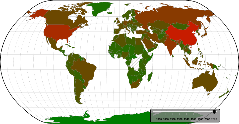
This is the visualization of CO2 emissions per year for a each country. The more red a given country is, the greater the emissions are. This is the link to the dataset: https://github.com/owid/co2-data?tab=readme-ov-file
I took a sub set of the data so that it was simplified. I intend to add a key and tool tips in the future.
MIT Licensed